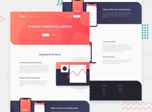
Design comparison
Solution retrospective
What I'm Most Proud Of:
Responsive Design:
Successfully implemented a layout that adapts seamlessly across various screen sizes, providing a consistent user experience on mobile and desktop. Interactive Dropdown Menus:
Created functional dropdown menus that enhance navigation and improve user interaction with the site. Clean Aesthetic:
Achieved a visually appealing design that aligns with the overall branding and style of the site. Learning and Growth:
Gained a deeper understanding of CSS and JavaScript, enhancing my problem-solving skills and ability to implement dynamic web features.
What I Would Do Differently Next Time:
Bug Prevention:
Implement more thorough testing throughout the development process to catch issues like the dropdowns not closing on the second click earlier. Code Organization:
Structure the JavaScript and CSS more efficiently from the beginning to ensure easier maintenance and scalability. Enhanced Accessibility:
Focus more on accessibility features, such as keyboard navigation and ARIA roles, to make the site more inclusive for all users. User Feedback:
Engage users earlier in the development process to gather feedback and make iterative improvements based on their experiences and suggestions. Documentation:
Maintain comprehensive documentation throughout the project to facilitate smoother handovers and future updates. Performance Optimization:
Pay closer attention to performance optimization, ensuring fast load times and smooth interactions even on lower-end devices.
What challenges did you encounter, and how did you overcome them?Challenge: Setting Up the Background of a Section
Complex Design Requirements:
The section background required a combination of a background image and a linear gradient, which needed to be properly positioned and responsive across different screen sizes. CSS Compatibility:
Ensuring the background styling was compatible across various browsers and devices to maintain a consistent look and feel.
How I Overcame These Challenges:
Research and Experimentation:
Conducted extensive research on best practices for combining background images and gradients. Experimented with different CSS properties and values to achieve the desired effect.
Community feedback
Please log in to post a comment
Log in with GitHubJoin our Discord community
Join thousands of Frontend Mentor community members taking the challenges, sharing resources, helping each other, and chatting about all things front-end!
Join our Discord
