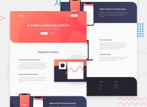
Design comparison
SolutionDesign
Solution retrospective
The menu is a little bit tricky, any feedback is welcomed. Thank you!
Community feedback
- @palgrammingPosted over 3 years ago
Looks really good and while the menus are tricky you did a good job with them you might want to center the mobile menu horizontally so on wider widths before the desktop navigation returns the header will look more balanced but otherwise really nice ⭐⭐⭐⭐⭐
0@mathew12tanPosted over 3 years ago@palgramming Thanks for your review and comment! 👍
0
Please log in to post a comment
Log in with GitHubJoin our Discord community
Join thousands of Frontend Mentor community members taking the challenges, sharing resources, helping each other, and chatting about all things front-end!
Join our Discord
