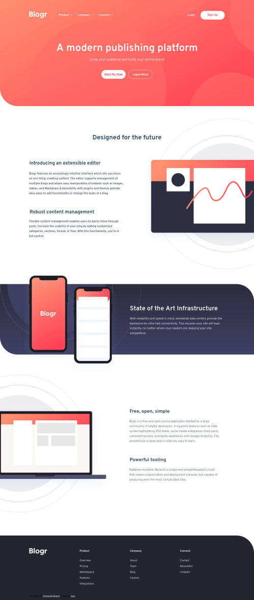
Blogr landing page [SASS/BEM/PARCEL] {NO JS}

Solution retrospective
This was the hardest challenge so far, I always try to make them pixel-perfect using PureRef (extremely useful software), at the beginning, it was easy for the mobile except for the size of some pictures which I had to make bigger and position them properly. Secondly, I wanted to challenge myself so I did not use Js. I worked with selectors and inputs but I realized it is easy to use a few JavaScript lines instead. (It's more readable and will help your future partners if they work with your code).
In the end, this challenge took me way more time than I expected but it helped me to use some properties such as clamp() I had to watch Kevin Powell's video a couple of times 😂. Also, the background-size and position gave me a lot of headaches. Good luck to anyone who tries this one!
Please log in to post a comment
Log in with GitHubCommunity feedback
No feedback yet. Be the first to give feedback on Iván De León Lino's solution.
Join our Discord community
Join thousands of Frontend Mentor community members taking the challenges, sharing resources, helping each other, and chatting about all things front-end!
Join our Discord