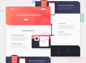
Blogr landing page challenge hub w/ sass, js & utility classes
Design comparison
Solution retrospective
I really enjoyed building this project since it was my first time building my own little utility class names using SCSS. I've also learned to structure files and folders in a more modular way. What do you guys think about the usage of utility class names? Any remarks would be highly appreciated :)
Community feedback
- @obriedanPosted almost 3 years ago
Hey @AF1QUE -- I just had a quick look. The page layout breaks between about 770px and 1150px viewport width. Those would be tablet to low-resolution laptop displays. I haven't learned SCSS yet so I couldn't offer any suggestions on how to fix it. 👍
1@AF1QUEPosted almost 3 years agoHey @obriedan, Thanks for leaving your feedback. The free design doesn't contain the layout for the tablet device so I decided to keep it like that. If I get time I would love to create a dedicated layout for tablet devices.
0
Please log in to post a comment
Log in with GitHubJoin our Discord community
Join thousands of Frontend Mentor community members taking the challenges, sharing resources, helping each other, and chatting about all things front-end!
Join our Discord
