Blogr Landing Page - Built with HTML, SCSS , and JavaScript
Design comparison
Solution retrospective
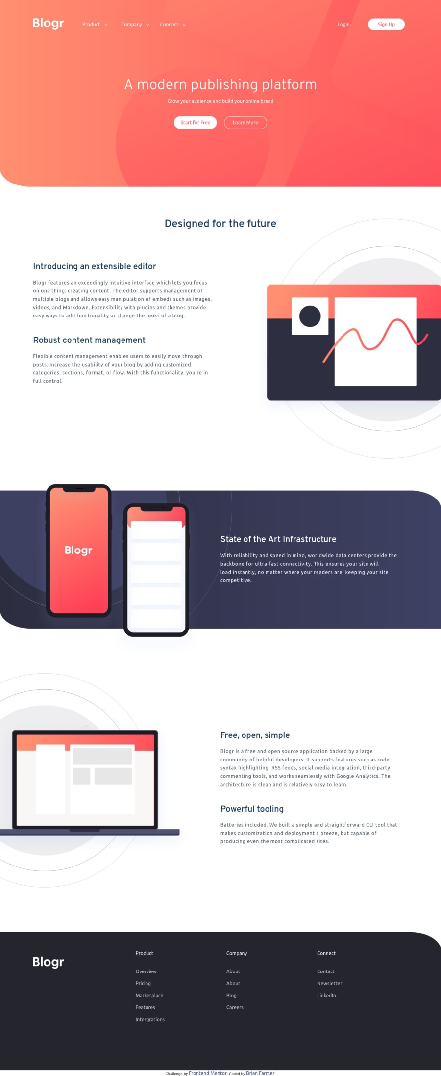
Wow this was a fun challenge. Thanks frontendmentor team! It was a great design for flex-box practice and I learned a lot.
The submenu was a challenge for me but I was able to discover some nice solutions to create the functionality I was aiming for. More details on that in my README.
Its not 100% mobile responsive for IPad and tablet view so I still need to work on that but mobile and desktop worked out pretty nicely.
Community feedback
- @palgrammingPosted over 3 years ago
not sure why you are saying it is not responsive it looks ok to me from mobile to desktop. it might not be pixel perfect with every margin and element but it looks good enough that one should not know something is wrong in general
But I did notice two things
- the options in the popup nav are not centered between the text links and the buttons
- in desktop mode you can get the in login button to hang with different background colors when clicked not sure if you did that on purpose of what is happening with it
0
Please log in to post a comment
Log in with GitHubJoin our Discord community
Join thousands of Frontend Mentor community members taking the challenges, sharing resources, helping each other, and chatting about all things front-end!
Join our Discord
