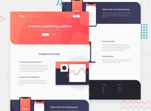
Design comparison
SolutionDesign
Solution retrospective
kindly, analyse my creation and critique. Any suggestions on improvements are welcomed, especially on how to handle the background of the hero section
Community feedback
Please log in to post a comment
Log in with GitHubJoin our Discord community
Join thousands of Frontend Mentor community members taking the challenges, sharing resources, helping each other, and chatting about all things front-end!
Join our Discord
