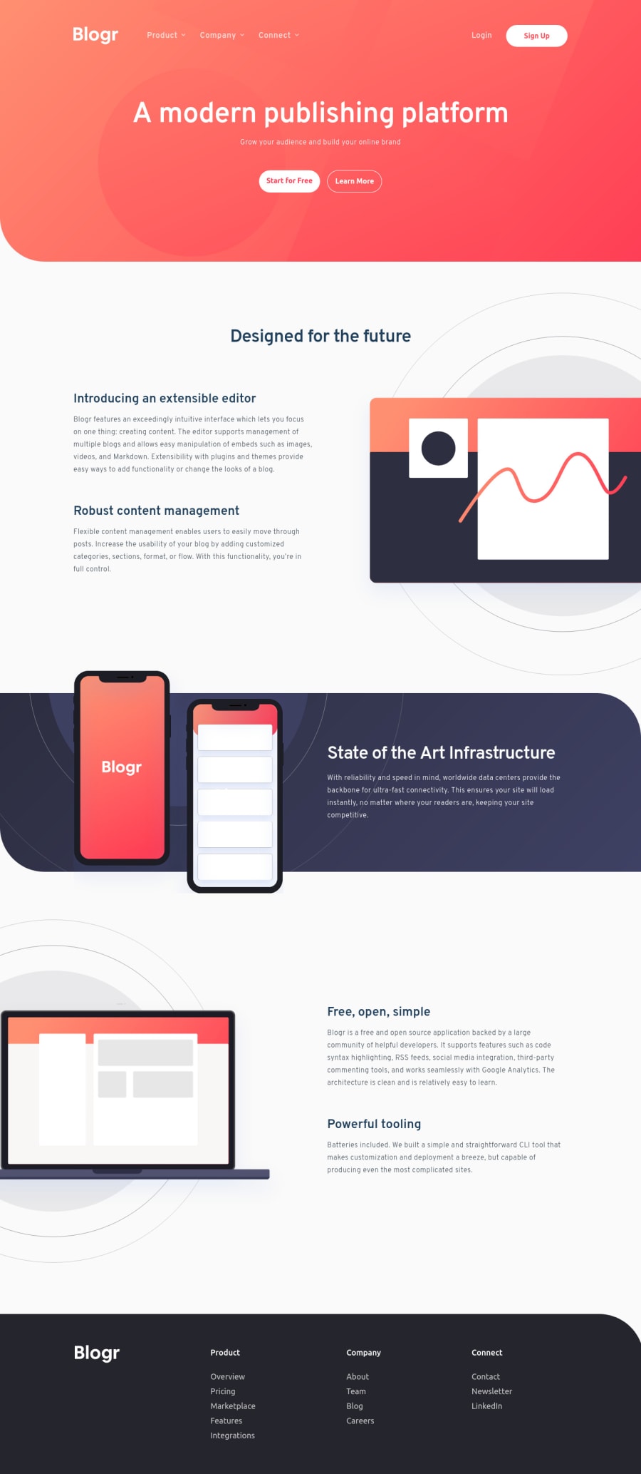
Blogr Landing Page - Accessible Nav & Fluid grid
Design comparison
Solution retrospective
Hey all,
(Question on the bottom, summary on the top).
Just one I did for fun. I realised I could practice building keyboard-accessible navigation with some thought given to tabindex and when to add/remove it from the collapsible links. Then I realised how badly I wrote my JS and refactored it to be more readable.
I gave special attention to the transitions/animations for the header. You will see the collapsible menu-categories transition themselves from the direction/location of the buttons that activate them. I also added smooth transitions for the actual link-containers as well, the max-height, gap, padding and margin properties together is what makes the smoothness possible.
Also learned about what exactly scrollHeight is and that it does not seem to include some aspects of the content, I believe it was omitting/excluding line-height of my <a>'s for example. It also ignores things like the gap property of any parent flex container. So I just wrote my own customScrollHeight variable. All in all I didn't expect to learn so much, as minor as it may seem at first. AWESOME project.
I paid attention to making sure the grids I used were smooth. I did NOT pay attention to the background image for the hero, just sort of threw it in there with rough calculations, I'm sorry :(.
Question: Does anyone have any good thinking-framework for working with CSS grid? Some sort of a mental model with which to follow and break grid-down? My current style is based on analysing the design and then just fitting the grid in, mobile first with an OK understanding of the various grid-units we can use for rows/columns. But beyond that it's laissez faire.
Cheeeeeeers 😁
Community feedback
- @Duyen-codesPosted over 3 years ago
Thanks for completing project! It looks great. Love the smooth transitions and stuff. Really cool!
Marked as helpful1@grizhlieCodesPosted over 3 years ago@Duyen-codes was somewhat harder than I expected hehe. Mostly because I went overboard with the header 😇
If it sparks any questions than just ask btw.
1 - @Renato6GSPosted over 3 years ago
Hello
The images of the articles are not the same as the design. I think it is a Chrome and Edge problem, because in Firefox it does work perfectly.
I recommend that you try your practices in different browsers.
Marked as helpful1@grizhlieCodesPosted over 3 years ago@Renato6GS Cheers! Yeah, I know - I don't quite know why this is happening - YET. I did this in Firefox, Safari and Chrome, did not think to test it on Edge.
For me the different one is in Safari, haven't spent the time to figure out why. I don't think I used any 'weird' properties but we'll see :P
1@grizhlieCodesPosted over 3 years ago@Renato6GS Oh yeah - to be clear, is it the laptop image? Or more? I only saw differences for the laptop image. I think it's to do with the text-container width more than the image but not sure yet.
0@Renato6GSPosted over 3 years ago@grizhlieCodes In the editor and latop they appear positioned differently. The editor image is not shifted to the right. The image of the laptop is not shifted to the left. I also did this exercise, and my solution was to edit the images and make that cut.
1@grizhlieCodesPosted over 3 years ago@Renato6GS What version of Edge is it may I ask? I wonder what the heck the problem could be.
For me this now works in Safari, Chrome and Firefox (same size/location) - but my system is freshly installed as I just got a new laptop.
Wondering what property could be messing it up on Edge ☹️...
I'll ask a friend to also check it out on different browsers. Now I'm more confused 🥲
0@grizhlieCodesPosted over 3 years ago@Renato6GS So, I just tried a beat up laptop given to me by work, run Edge and Chrome side by side, seemed the same to me on there!
I think it must be something to do with versioning? I can't even check from my side since it all seems identical :(.
0@HusJAWPosted over 3 years ago@Renato6GS it works perfectly fine for me on Chrome, Safari, Firefox and it is identical.
Marked as helpful1@Renato6GSPosted over 3 years ago@grizhlieCodes My Edge version is 96.0.1054.53. My screen is 21 inches.
0@grizhlieCodesPosted over 3 years ago@Renato6GS I don't know bud, I can't replicate the issue you're seeing.
I tried on my 13" work laptop, 27" monitor, 49" monitor, 24" monitor and finally my 16" personal laptop, across all browsers. My edge version is 96.0.1054.57 - so not different enough to warrant massive changes. I'm not sure!
0 - @grizhlieCodesPosted over 3 years ago
Oh yes - I'll probably correct minor styling things shortly. I seem to have omitted quite few 'details'.
0
Please log in to post a comment
Log in with GitHubJoin our Discord community
Join thousands of Frontend Mentor community members taking the challenges, sharing resources, helping each other, and chatting about all things front-end!
Join our Discord
