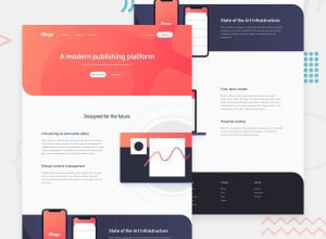
Design comparison
Solution retrospective
- I could use some help sizing and positioning of the Phones image in the "State of the Art Infrastructure" section on smaller screens.
Although I was able to get it to fit inside the background by setting the width to 410px and height to 380px, the width is still showing 470px in developer tools.
Community feedback
- @eleswastakenPosted almost 3 years ago
The images in general have to be set to
width: 100%;to fit into a container, andmax-width: 100%so not to overflow. But you don't usually set some fixed width.In your solution you set
.features-2 imgto somemin-widthwhich made it fixed width, then you overrode it widthobject-fit: contain;, that is why it appeared normal and with wrong sizing. What's the solution? You could make the image width relative to the parent, e.g. on tablets it could be 60% of the parent, on smaller tablets 75%, on mobile 100%.Side notes:
- Your mobile menu is not hidden; it is just transparent. Opacity is transparency.
- For almost every piece of text there is and element to use. For paragraphs there is
<p>, for headings there is<h1>to<h6>. - Set paddings to the container, so it would be the limiter to the content. When you set paddings to every element, it might be hard to be consistent.
Best of luck!
Marked as helpful0
Please log in to post a comment
Log in with GitHubJoin our Discord community
Join thousands of Frontend Mentor community members taking the challenges, sharing resources, helping each other, and chatting about all things front-end!
Join our Discord
