Design comparison
Solution retrospective
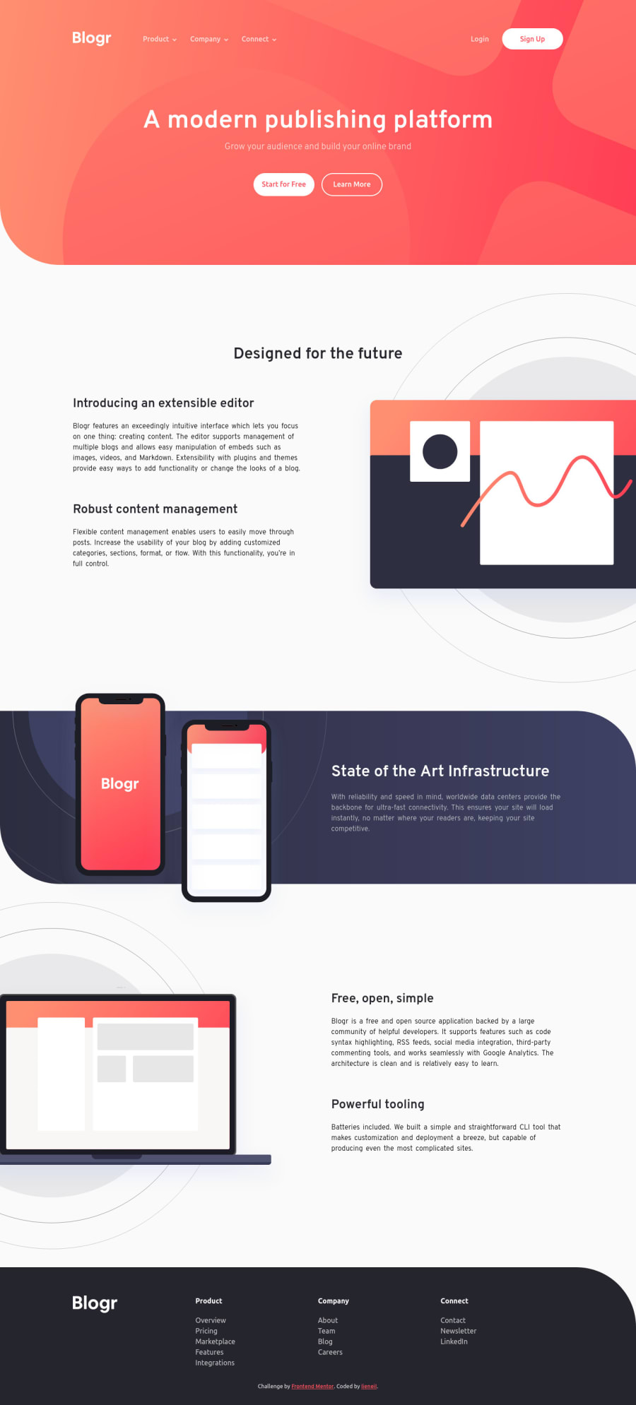
On first glance, this challenge looks pretty simple and easy. I struggle a lot, especially with illustrations, because most of them have extra white spaces and overflows on their parent element. I haven't done this kind of design before, I thought that the assets given to the developer are already fixed and all we have to do is to put the images in the right places. I really underestimated this challenge.
Overall, I enjoyed and learned a lot from this challenge, and I'm planning to do more of these kinds of challenges.
Please feel free to tell me your thoughts about my solution.. THAAAANKS
Community feedback
Please log in to post a comment
Log in with GitHubJoin our Discord community
Join thousands of Frontend Mentor community members taking the challenges, sharing resources, helping each other, and chatting about all things front-end!
Join our Discord
