Design comparison
Solution retrospective
Managed to get most of it done.
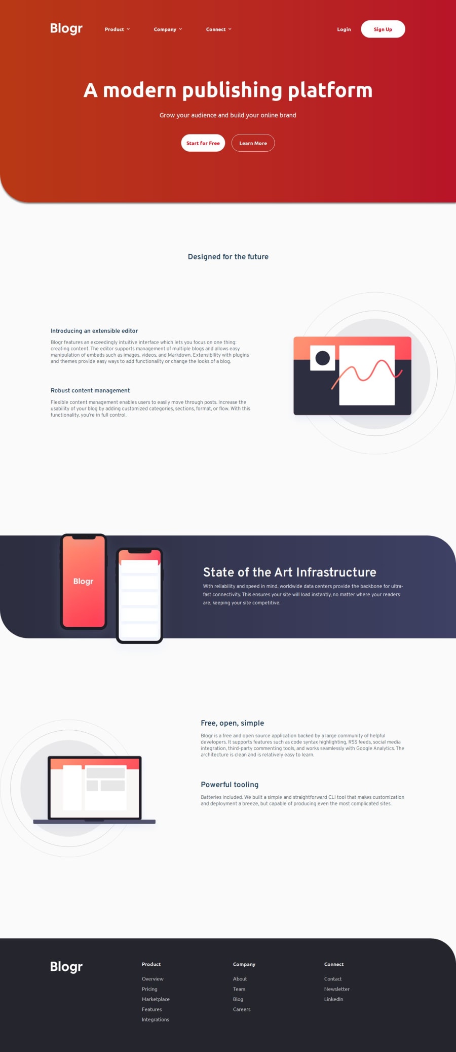
What challenges did you encounter, and how did you overcome them?I couldn't figure out the backgrounds on the header and the "State of the Art" section. I changed the header gradient because of contrast issues with the text, so I'm not sure the background circles would fit for those colors. The trouble with the "State of the Art" section was that the circle was either on top of everything or not showing. My disdain for background "decorations" continues xD
What specific areas of your project would you like help with?I also couldn't figure out how to make the menu dropdowns independent. The functionality works, the dropdowns show when the button is clicked, and disappear when the button is clicked again. But every time I click one of them, all the others also show/disappear.
Community feedback
- @RoksolanaVeresPosted 11 months ago
Hey, your solutions often give me enough food for thought but this one was probably the most challenging one 😅
So I had been trying to solve the problem with all three menus getting open simultaneously for almost an hour, messing with the JS part and wondering why it didn't work as it was expected. Then when I almost gave up I decided to check HTML. When I changed aria-expanded in one of the navbar__item-s from "false" to "true" ... all three menus got open (even though the rest two had aria-expanded="false") ... interesting!
Long story short: the problem is in your CSS, this part:
.header:has(.navbar__button[aria-expanded="true"]) {
    .navbar__icon {
        transform: rotate(180deg);
    }

    .navbar__list-wrapper {
        display: block;
    }
}

.header:has(.open-menu-btn[aria-expanded="true"]) {

    .header-top {
        position: relative;
        flex-direction: column;
        align-items: initial;
    }
       ...
in HTML .header is above all three menu buttons, thus if even one of the button has aria-expanded="true",
.header:has(.navbar__button[aria-expanded="true"])becomes true and CSS from that block is applied to all three menu buttons.You should just change .header:has... to .navbar__item:has... and everything works fine :)
.navbar__item:has(.navbar__button[aria-expanded="true"]) {
   ...
}

.navbar__item:has(.open-menu-btn[aria-expanded="true"]) {
...
}
Marked as helpful1P@Islandstone89Posted 11 months ago@RoksolanaVeres That worked- thank you so much! :)
1 - @ZHADOW999Posted 11 months ago
hey there :) good work your project but i got a few improvements for you😁
USE THIS code for the hero section to fix the background image and add the gradient
the background position property just helps to position the image in the container
background repeat : sets the image to not repeat
background size : just sets the size of the image
so yeah play around with to get your desired look
This approach will also work for the "State of the Art Infrastructure" section too, just change the image and the linear gradient color ^_^ and mess around with the back position and size
background-image:url(./images/bg-pattern-intro-desktop.svg), linear-gradient(
    to right,
 hsl(13, 100%, 72%)19%,
 hsl(353, 100%, 62%)50%);
background-position:  27% 52%;
background-repeat: no-repeat;
background-size: 220%;
border-radius: 0 0 0 5rem;
color: white;
And now for the java script this was the code i used
just add a show class to the css file like this
.show{opacity: 1;}
i set my dropdown to an opacity of 0, but you can use display: none on the dropdown and display block in the show class if you prefer that so the dropdown will set a display on click
.arrow{ transform: rotate(180deg); } added this arrow class to the css to make the arrow to turn 180deg on click
soo this code will set the dropdown to show when the button is clicked
function myFunction() { document.getElementById("dropdown1").classList.toggle("show"); document.getElementById("arrow").classList.toggle("arrow"); document.getElementById("arrow2").classList.toggle("arrow"); }
// Close the dropdown menu if the user clicks outside of it
window.onclick = function(event) { if (!event.target.matches('.dropdown-rel')) { var dropdowns = document.getElementsByClassName("dropdown"); var i; for (i = 0; i < dropdowns.length; i++) { var openDropdown = dropdowns[i]; if (openDropdown.classList.contains('show')) { openDropdown.classList.remove('show'); } } } }
i hope this helps 😁😁😁😁
Oh yh I forgot to add that if you want to do different drop downs just use the same code but changed the function name for each drop-down
Marked as helpful0 - @dareyOGPosted 11 months ago
Hi @Islandstone89, amazing work you've done; good job. Meanwhile, in your mobile view, the dropdown lists seem to be behind a neighbor parent element. Applying a z-index property should bring them forward.
1
Please log in to post a comment
Log in with GitHubJoin our Discord community
Join thousands of Frontend Mentor community members taking the challenges, sharing resources, helping each other, and chatting about all things front-end!
Join our Discord
