Submitted over 2 years agoA solution to the Blogr landing page challenge
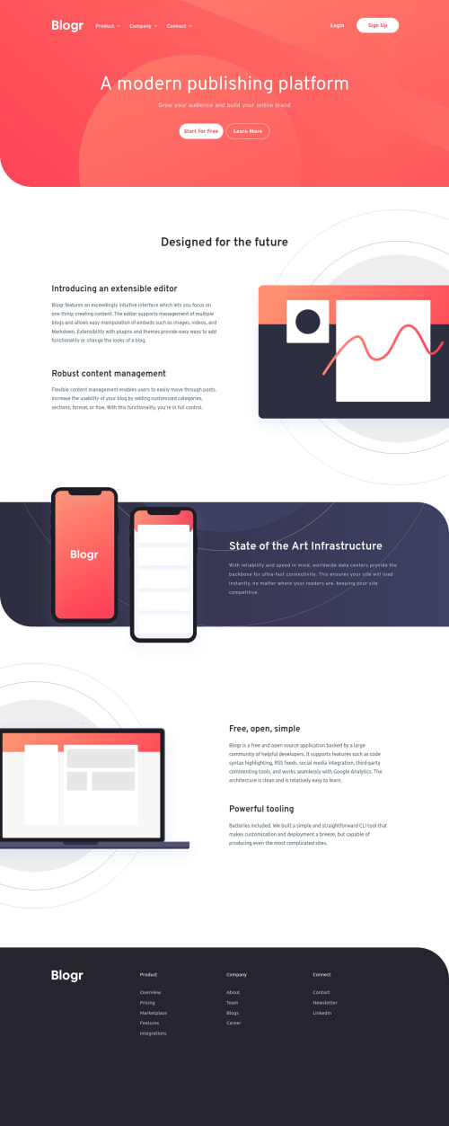
Blogr Landing Page
sass/scss
@ArmsAndArrows

Solution retrospective
It seemed easier before I started.
How to implement dropdown menu in one piece of code? It seems like buttons within are totally separated from accordion titles in desktop menu and totally together in mobile version. I'd like to keep DRY principles but this case kicked me off. Anyway this challenge is great.
Code
Loading...
Please log in to post a comment
Log in with GitHubCommunity feedback
No feedback yet. Be the first to give feedback on Shchetkov Maksim's solution.
Join our Discord community
Join thousands of Frontend Mentor community members taking the challenges, sharing resources, helping each other, and chatting about all things front-end!
Join our Discord