Design comparison
SolutionDesign
Solution retrospective
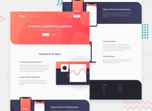
I used plain css (media quieries) and JS (responsive menu). my responsive design includes a little adjust for mid resolutions (tablets).
I used media queries in only one section for mobile that includes header, footer, etc. And a little secction for tablets... not sure if this is the best practice.
I also tried using BEM but i failed (lol), i need to plan better my next challenge.
Community feedback
Please log in to post a comment
Log in with GitHubJoin our Discord community
Join thousands of Frontend Mentor community members taking the challenges, sharing resources, helping each other, and chatting about all things front-end!
Join our Discord
