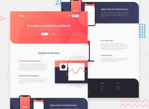
Design comparison
SolutionDesign
Solution retrospective
This challenge was very difficult for me to complete. I've learned a lot! All sugestions are welcome! Thanks
Community feedback
- @MojtabaMosaviPosted over 3 years ago
@lc-dev90 good job, the markup look clean but since aria-label should also be used on interactive elements such as button you should use it. In some places you can do small improvements such as:
-
in you header, it ok to have to container but one could accomplish the exact same thing.
-
This is just a tips, try to target elements with class attribute instead of selectors such as header mainly because it's more concise and clean in my opinion.
Keep coding :=)
1 -
Please log in to post a comment
Log in with GitHubJoin our Discord community
Join thousands of Frontend Mentor community members taking the challenges, sharing resources, helping each other, and chatting about all things front-end!
Join our Discord
