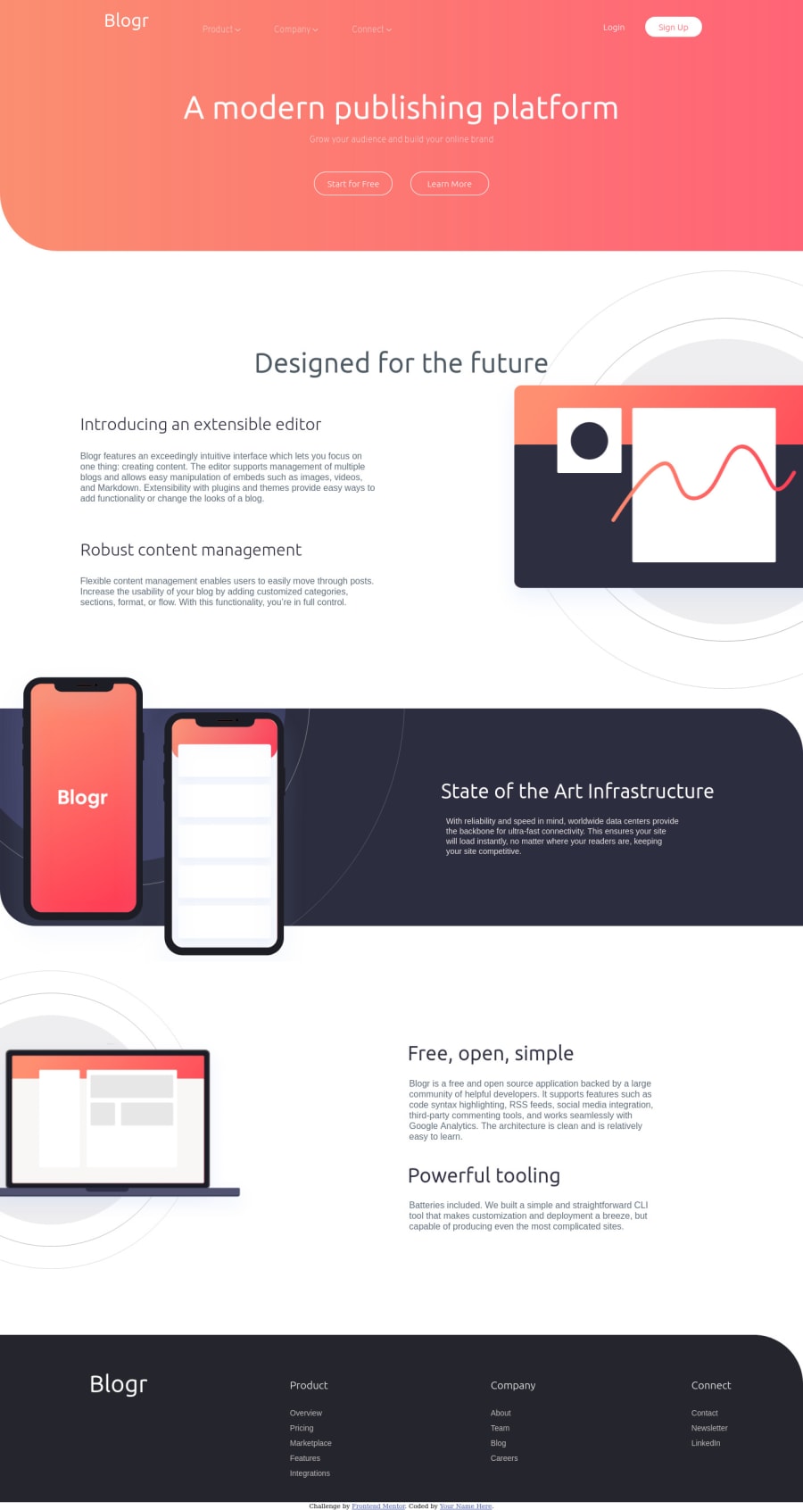
Design comparison
Solution retrospective
I have not implemented the mobile view for now .... but any feedback for my desktop view will be appreciated .. thank you
Community feedback
- @Amanpatil-DevPosted almost 4 years ago
Looks good in desktop by the way 👍
Little bit of un-alignment in mobile width .
One advice I have is when making any design first what I do personally is scale down the browser width to 425px and design according to mobile first and then scale up for like 768px then 992px then 1200px what this do is make the design more mobile friendly scaling up would be easy because u just have to write media queries for scaling up
Hope this helps👍
Happy coding 👌
1@shivam5750Posted almost 4 years ago@Amanpatil-Dev hey thanks for giving your time .... I really like your way so next time I will do the same😄
0 - @Sk7867Posted almost 4 years ago
Looks good on desktop, as @Amanpatil-Dev said try mobile-first approach. Also in your HTML code on line 69 there h6 tav class name issue.
0@shivam5750Posted almost 4 years ago@Sk7867 yess I will... Thanks for your feedback 😊
0
Please log in to post a comment
Log in with GitHubJoin our Discord community
Join thousands of Frontend Mentor community members taking the challenges, sharing resources, helping each other, and chatting about all things front-end!
Join our Discord
