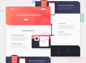
Design comparison
Solution retrospective
Hello! This is my first coding challenge on here. I would appreciate any feedback you have on the solution I've provided - especially on the coding part.
Thanks, Sofia
Community feedback
- @Karimsamir112Posted almost 4 years ago
hey Sofia , this is very good , I like it but I have some suggestions:
-you should use links inside the humburger photo like(product , company ,...), I mean when I click on the humburger photo , those links appear and you should put the close photo with links (when I click on the close photo , those links dissapear)
_ you can also put transition on links to be more beautiful on hover
like my website: https://karimsamir112.github.io/Blogr-landing-page/
I hope this help you , and if you want any other things I can help you .
overall you website is very very good for your first coding . happy coding and keep going 👍👏
0@sofskrbicPosted almost 4 years ago@Karimsamir112 Hey, Karim! Thank you so much for your feedback! I will make sure to fix it somewhere in the near future and have the suggestions in mind when building new projects.
0
Please log in to post a comment
Log in with GitHubJoin our Discord community
Join thousands of Frontend Mentor community members taking the challenges, sharing resources, helping each other, and chatting about all things front-end!
Join our Discord
