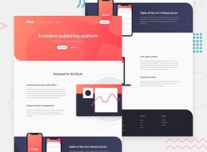
Design comparison
Solution retrospective
Hey Guys, I just finished the Blogr Landing Page Challenge. I would like you all to see it and let me know how I can improve it. Let me know my mistakes . Thank you!.
Community feedback
- @abhik-bPosted almost 3 years ago
👋 Hello Karishma , Your solution looks nearly perfect to me , I really liked the descriptive HTML markup you have written. One thing that bothers me is though your nav is responsive enough , the submenu is not visible on small screens even when
nav-item title headingis clicked , rather the menu gets closed. Other than that Well Done 🤩🤩🤩 Please keep coding this amazing solutions & Happy Saraswati Puja ❤️Marked as helpful0@karishma-devPosted almost 3 years agoHi @abhik-b, I have fixed this, now the submenu is visible on small screens. Thank you <3 & Happy Saraswati Puja <3.
1@abhik-bPosted almost 3 years ago@Krrish105 Yes I checked it & It works correctly now , well done 👍
Marked as helpful0
Please log in to post a comment
Log in with GitHubJoin our Discord community
Join thousands of Frontend Mentor community members taking the challenges, sharing resources, helping each other, and chatting about all things front-end!
Join our Discord
