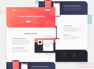
Design comparison
SolutionDesign
Solution retrospective
i find positioning background image hard. I need much more practice in backgrounds, if you have any useful advice, don't hesitate. Sorry for my english :)
Community feedback
- @ApplePieGiraffePosted almost 2 years ago
Hi there, Chris! 👋
Nice job on this challenge! 👏 Your solution looks good and is responsive! 😁
I'd like to suggest,
- Turning the navigation links in the footer of the page into actual links by wrapping each of them in an
atag. It would also be a good idea to use theulandlielements for each of those groups of links since they are lists of items. - Using
buttonelements for the elements that show/hide the dropdown menus in the header of the page (as well as for the hamburger menu button). - Setting the
altattributes for the icons in the hamburger menu to an empty string so that they will be ignored by screen readers and adding anaria-labelto the button to identify it. - It may be worth setting the values for properties like
marginandpaddinginemandremtoo (instead ofpx) so that those values will scale with the root/parent font size. That way, the entire design of your site will change with the font-size.
Hope you find these tips helpful. 😊
Keep coding (and happy coding, too)! 😁
Marked as helpful0 - Turning the navigation links in the footer of the page into actual links by wrapping each of them in an
Please log in to post a comment
Log in with GitHubJoin our Discord community
Join thousands of Frontend Mentor community members taking the challenges, sharing resources, helping each other, and chatting about all things front-end!
Join our Discord
