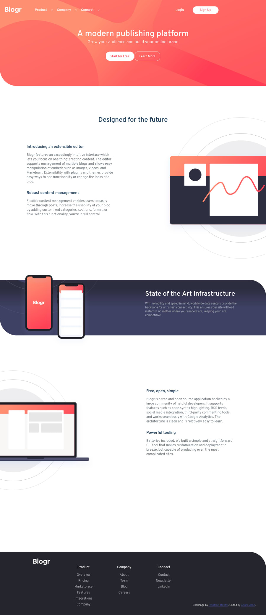
Design comparison
Solution retrospective
The mobile version looks pretty spot on. The desktop is...kinda yikes. Once it came to styling the desktop, I felt like every decision I made when setting up the HTML for mobile-first came back to haunt me, and every style on desktop was a big headache.
Is there a strategy to setting up your HTML so it adapts well when scaled up to desktop, so you don't have to go back and add a bunch of wrapper divs and CSS overstyling? Or do you just have to look at the desktop sketch and try to anticipate all your layout shifts when you're setting up your HTML for mobile?
Community feedback
- @ChamuMutezvaPosted over 3 years ago
- since this
<div class="navbar__hamburger" id="hamburger"></div>is supposed to be interactive (button) , users of assistive technology will not be able to identify it as such, hence they won't be able to utilise it - the immediate child of a
ulelement should be anlielement. A div can only come in as a child of thelielement. - your list items
Overview, marketplace, features etcshould be anchor tags since generally they should be links to other pages - as to your question about the strategy of setting up html: i think they are somethings that cannot be avoidable until you have mastered the ins and outs of the game. The planning must be done with both or all the designs in mind but that can change during implementation resulting in the addition and or subtraction of the ideas.
1 - since this
- @palgrammingPosted over 3 years ago
Maybe someone else can help you with you SASS but it seems like you are holding the mobile navigation too long a the browser window widens
1
Please log in to post a comment
Log in with GitHubJoin our Discord community
Join thousands of Frontend Mentor community members taking the challenges, sharing resources, helping each other, and chatting about all things front-end!
Join our Discord
