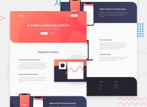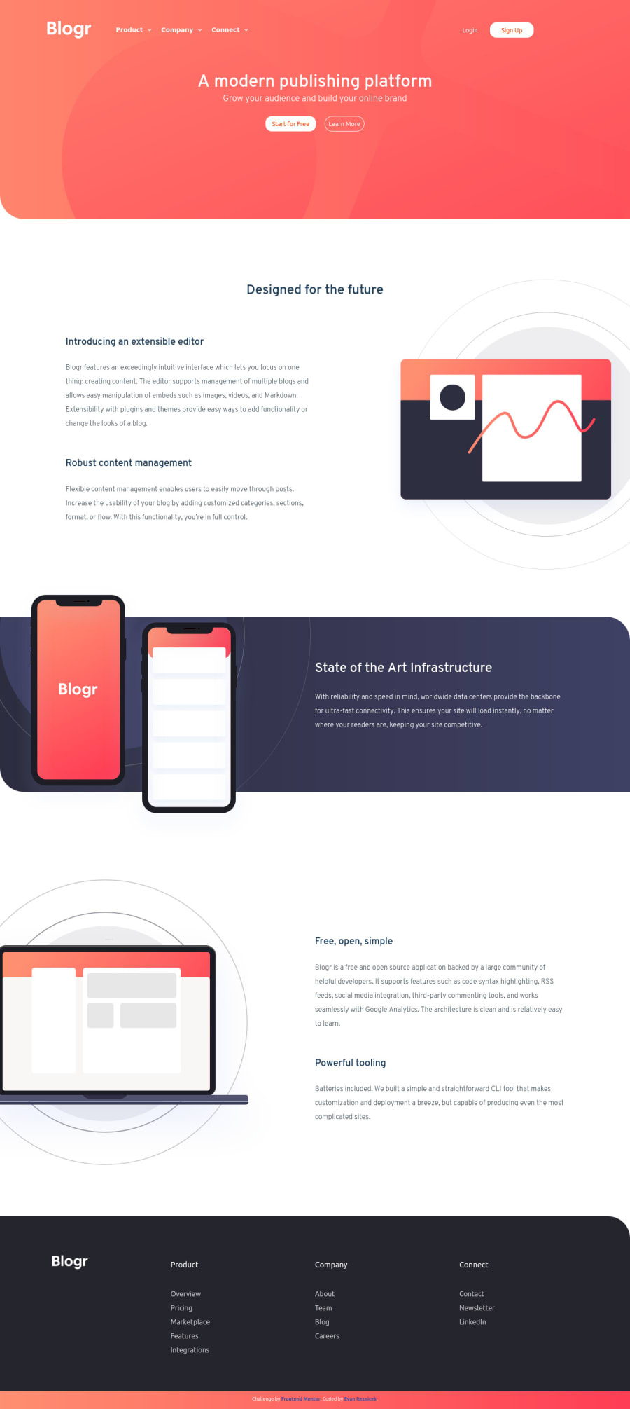
Design comparison
Solution retrospective
I had some difficulty with the sizing various items and with background circles of the image assets. Would love some feedback and advice as well as other things I could improve. This was a great challenge, learned a couple new things and helped sharpen my weak CSS skills.
Community feedback
- @ApplePieGiraffePosted over 3 years ago
Hey, Evan Reznicek! 👋
Nice job on this challenge! 👏 I like the transition you added to the dropdown-menus in the header! 😀 It's good to hear that you learned new things while completing this challenge! 👍
A few things I'd like to suggest are,
- Turning the navigation links in the dropdown-menus in the header of the page into links by wrapping each of them in an anchor tag.
- Making sure that the illustrations in the information sections of the page do not cover up the text content next to them when the width of the screen decrease in the desktop layout (as palgramming suggested).
- Perhaps increasing the size of the heading and buttons in the hero section of the page a bit (to match original design a little better). 😉
Keep coding (and happy coding, too)! 😁
Marked as helpful1@evanRezPosted over 3 years ago@ApplePieGiraffe big shout out to you for being super helpful with your specific comments. I really appreciate them. I was getting some grief from react's console warnings using my blank anchor tags, didn't know that it was noticeable, you have a great eye for this. I'll definitely be looking into my transition points to fix those sometime in the near future!
0 - @palgrammingPosted over 3 years ago
overall it looks like you have the elements and your menus seem to work good. Problem is at 850px wide screens you have text going under images. I think if you change you mobile to desktop transition point you can solve a lot of those issues
1@evanRezPosted over 3 years ago@palgramming Thanks for taking the time to look at my project, yeah you're right I didn't really account for any other screen sizes other than desktop and mobile. Do you usually have a pixel threshold in mind or do you usually test certain ones out until you find one that works?
0
Please log in to post a comment
Log in with GitHubJoin our Discord community
Join thousands of Frontend Mentor community members taking the challenges, sharing resources, helping each other, and chatting about all things front-end!
Join our Discord