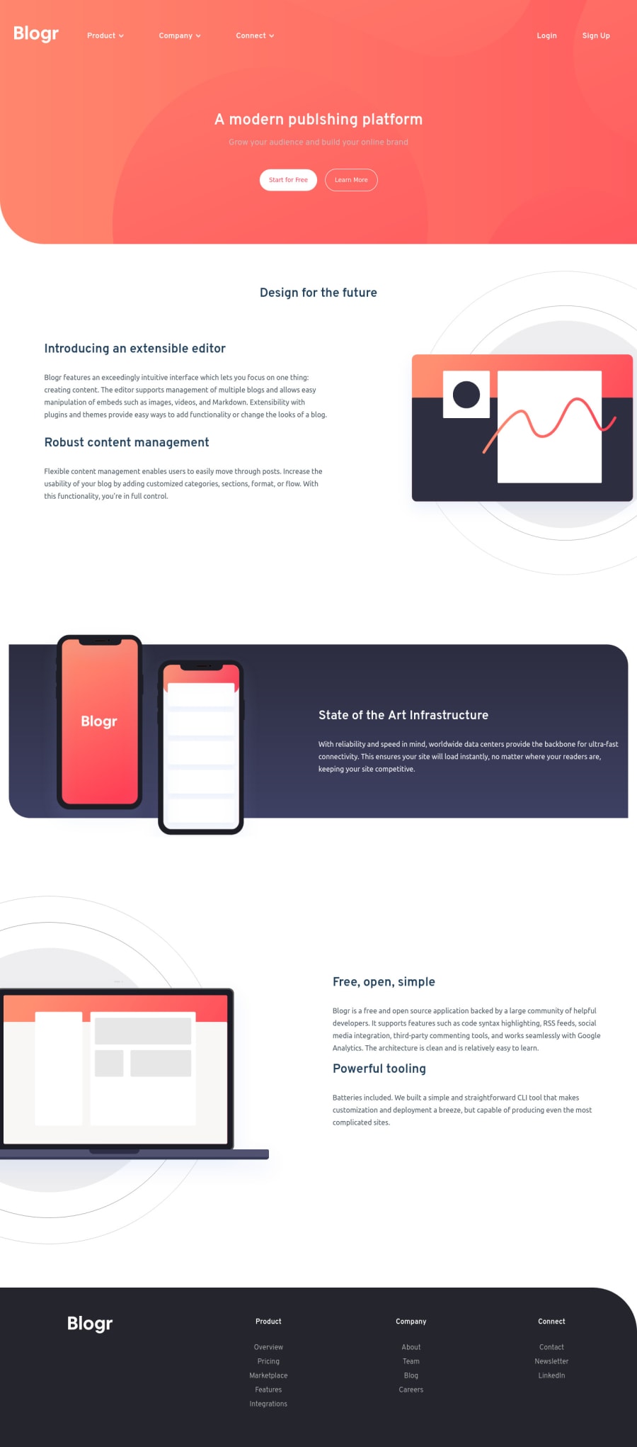
Design comparison
SolutionDesign
Solution retrospective
Had some difficulties in making this project. Could not fix an issue where the web page changes responsive states from mobile to desktop. When the navbar button has been used the hamburger menu does not disappear. If anyone knows the reason feedback much appreciated. Also, feedback on other issues that I have not discovered is appreciated also. Always striving to improve :) !
Community feedback
- @AdrianoEscarabotePosted about 2 years ago
Hi Ioan, how are you?
I really liked the result of your project, but I have some tips that I think you will enjoy:
- The links must have an aria-label or sr-only text that tells where the link navigates the user. For example: Visit our Facebook. For images, you should set aria-hidden=” true” to be ignored by screen readers and to avoid redundancy and repetition.
The rest is great!
I hope it helps... 👍
0
Please log in to post a comment
Log in with GitHubJoin our Discord community
Join thousands of Frontend Mentor community members taking the challenges, sharing resources, helping each other, and chatting about all things front-end!
Join our Discord
