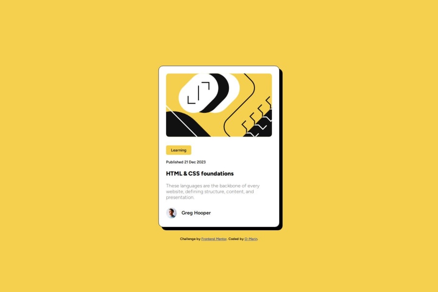
Design comparison
Solution retrospective
Good day, happy to be here.
I couldn't figure out how to change the shadow of the main container when hovering over the HTML & CSS foundations heading as shown in the base designs. Would appreciate if anyone could point me in the right direction. Thanks in advance for the attention and time taken to read.
Community feedback
- @Kshitiz42069Posted 9 months ago
Hey there! You have made a great template, and for the shadow for the main container you can provide hover effect for the "main" similar to what you have given to h2, In the hover effect increase the box-shadow attributes to 15px or whatever you feel will look good on your design.
Marked as helpful1@o-marinPosted 9 months ago@Kshitiz42069 that's a good point, don't know why I felt it should only change when hovering on the h2 instead of when the cursor is on the card itself. thank you!
0 - @danielmrz-devPosted 9 months ago
Hello there! šš½āāļø
Your solution looks excellent!
I have a suggestion about your code that might interest you:
š If you don't have the Figma design files, I recommend using a browser extension called Perfect Pixel.
It allows you to compare your finished project with the design images that come along when you download the project and check the (almost exact) dimensions. It's very useful!
I hope it helps you in future projects! š
Other than that, great job!
0
Please log in to post a comment
Log in with GitHubJoin our Discord community
Join thousands of Frontend Mentor community members taking the challenges, sharing resources, helping each other, and chatting about all things front-end!
Join our Discord