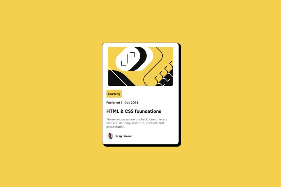
Design comparison
Solution retrospective
I could be wrong, but I think my code is cleaner compared to my previous attempts.
What challenges did you encounter, and how did you overcome them?Some of the challenges I've faced are box-shadow and spacing between the content.
What specific areas of your project would you like help with?All feedback is welcome and thank you in advance. NOTE: I'm also in the process of learning more on CSS units any advice would be very much appreciated.
Community feedback
- P@danielmrz-devPosted about 1 year ago
Hey @Si1entERA!
Your solution is really impressive!
I've got an idea (about how to use HTML better) that could make it even stronger:
📌 Consider employing
<h1>to<h6>tags for headings rather than using<p>.The
<p>tag is primarily intended for paragraphs. When it comes to headings, HTML offers us a range of heading tags: from<h1>to<h6>.Here's a quick guide on how to use them:
- The
<h1>to<h6>tags are used to define HTML headings. <h1>is for the most important heading.<h6>is for the least important heading.- Stick to just one
<h1>per page – it should be the main title for the whole page. - And don't skip heading levels – start with
<h1>, then use<h2>, and so on.
It's more than just text size — it's about structuring your content effectively.
These tweaks might not change how your page looks, but they'll make your HTML code clearer and help with SEO and accessibility.
Hope that's helpful!
Keep up the great work!
Marked as helpful0 - The
Please log in to post a comment
Log in with GitHubJoin our Discord community
Join thousands of Frontend Mentor community members taking the challenges, sharing resources, helping each other, and chatting about all things front-end!
Join our Discord
