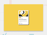
Design comparison
Community feedback
- @Islandstone89Posted 8 months ago
HTML:
-
Every webpage needs a
<main>that wraps all of the content, except for<header>andfooter>. This is vital for accessibility, as it helps screen readers identify the "main" section of a page. Change.containerto a<main>. -
The images should be placed in
<img>tags in the HTML, and must have alt text. -
Headings should always be in order, so you never start with a
<h3>. "Learning" is also not a heading, so change it to a<p>. As headings are meant to introduce new content, I would also change "Gary Hooper" to a<p>. -
Wrap the date in a
<time>element:<p>Published <time datetime="2023-12-21">21 Dec 2023</time></p>. -
.attributionshould be a<footer>, and its text must be wrapped in a<p>.
CSS:
-
It's good practice to include a CSS Reset at the top.
-
Use the style guide to find the correct
font-family. -
Add around
1remofpaddingon thebody, so the card doesn't touch the edges on small screens. -
On the
body, changeheighttomin-height- this way, the content will not get cut off if it grows beneath the viewport. Removeoverflow: hidden, it is not needed. -
Remove all widths and heights, except for on the profile image.
-
Add a
max-widthof around20remon the card, to prevent it from getting too wide on larger screens.
Marked as helpful0 -
Please log in to post a comment
Log in with GitHubJoin our Discord community
Join thousands of Frontend Mentor community members taking the challenges, sharing resources, helping each other, and chatting about all things front-end!
Join our Discord

