Design comparison
SolutionDesign
Community feedback
- @DanCodeCraftPosted about 1 year ago
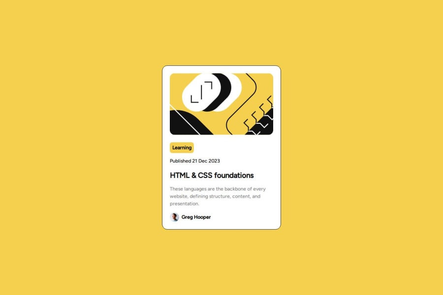
Hey, @marwa20201! It looks super good.
I would suggest you go further in the challenge and add that shadow on the right side of the card, as well as its effect. Talking about effects, you can add a transition property to your hovering. It creates a super good effect for one line of code.
Also, to keep your code cleaner, you can look for a modern CSS reset instead of the *{ margin, padding, box}.
Keep it up!
Marked as helpful0
Please log in to post a comment
Log in with GitHubJoin our Discord community
Join thousands of Frontend Mentor community members taking the challenges, sharing resources, helping each other, and chatting about all things front-end!
Join our Discord
