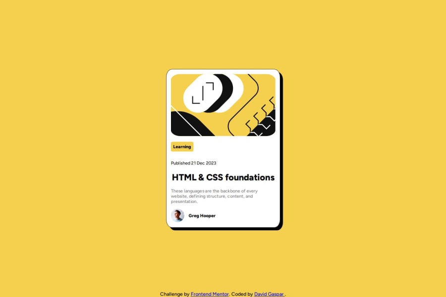
Design comparison
Solution retrospective
What I am most proud of is the time and ease of doing this project.
What challenges did you encounter, and how did you overcome them?As with the QR project, the biggest challenge has been to center the container and make it responsive.
What specific areas of your project would you like help with?Tips related to responsive are welcome.
Community feedback
- P@ralphvirtucioPosted 12 months ago
Hi David,
Nice job on completing this challenge !!
Suggestions to your CSS.
- Remove the text-align: justify in the body element and text-align: center in the h1 element.
- Try using a CSS reset you can read more about in this link: https://www.joshwcomeau.com/css/custom-css-reset/
- Consider using max-width for more fluid container you can this link : https://developer.mozilla.org/en-US/docs/Web/CSS/max-width
- If you want to know more about the max-width and width you can read this article out: https://css-tricks.com/tale-width-max-width/
For accessibility:
- For the alt of the image, try more descriptive for the image, for example the avatar you can use Profile of Greg Hopper.
so far you did great on completing this challenge
CODE UP !
Marked as helpful1 - P@BigO-DevPosted 12 months ago
Semantic HTML
Assessment:
- You've used
<main>and<footer>, which are semantic elements that help define the structure of the web page. This is good practice. - However, there's an error with a
<p>tag incorrectly closed with</h2>. It should be properly closed with</p>.
Suggestions for Improvement:
- Correct the closing tag for the paragraph that starts with
<p class="tag">Learning</h2>. - Consider using
<article>for the card container to provide more semantic meaning to the content block which seems to represent an article.
Accessibility
Assessment:
- Alt attributes are used for images, which is good for screen reader users.
- There's an attempt to make the site navigable and informative, but some improvements can be made.
Suggestions for Improvement:
- Ensure that text contrasts adequately against the background to meet WCAG AA or AAA standards.
- Use semantic HTML tags where possible to improve the structure and accessibility of the content.
- The
<div>with class "author" should use a proper<figure>and<figcaption>element for the avatar and its caption.
Responsive Design
Assessment:
- The media queries are used to limit the width of the container on larger screens, which can help maintain the layout's integrity.
- However, the fixed width (375px) and scaling might not be the best approach for all device sizes.
Suggestions for Improvement:
- Rethink using
transform: scale(0.9)as this could lead to unpredictable layout results. Instead, use responsive units like percentages or viewport units for better control. - Ensure padding and margins are responsive, using relative units like percentages or
em/remrather than fixed pixels where possible. - Expand on your media queries to ensure the layout adapts well not just in width but also in spacing, font sizes, and other dimensions across different devices.
Code Quality
Assessment:
- The CSS is organized with root variables, which is great for maintaining a consistent theme.
- Some styles and properties are not optimally used or could be simplified.
Suggestions for Improvement:
- In
.author,flex-direction: center;is invalid. If you meant to center items, usejustify-content: center;andalign-items: center;within a flex container. - Avoid using
position: absolute;for the footer unless absolutely necessary. This can lead to content overlapping or being cut off on smaller screens. Consider alternatives likeposition: relative;or flex layouts. - Clean up any redundant semicolons and ensure CSS properties are valid and used correctly.
Summary
Your code is on the right track with a good use of CSS custom properties and semantic HTML elements. Focus on fixing the noted errors, improving accessibility features, and refining the responsive behavior of your layout to enhance usability and maintainability. This will lead to a more robust and user-friendly web page.
Marked as helpful0 - You've used
- P@Islandstone89Posted 12 months ago
Hi, well done!
Here is some feedback:
HTML:
-
I would use
classinstead ofidon the images. -
Consider wrapping the date in a
<time>element:<p>Published <time datetime="2023-12-21">21 Dec 2023</time></p>. -
The heading would have a link, as this is a blog card.
-
You don't need to write "image" in the alt text, as screen readers will read that by default. A suitable alt text for the profile image would be "Headshot of Gary Hooper".
-
Footer text should be wrapped in
<p>.
CSS:
-
Including a CSS Reset at the top is good practice.
-
Add around
1remofpaddingon thebody, so the card doesn't touch the edges on small screens. -
When declaring
display: flex, the default value isflex-direction: row, meaning flex items go side by side. Here, we want them to stack, so addflex-direction: columnon thebody. I would also addgap: 2remto make sure there is distance between the main and the footer. Remove the absolute positioning on the footer. -
I would use
pxorremforborder-radius. -
Change the
max-widthto20rem. -
centeris not a valid value forflex-direction. You do not need to set theflex-direction- in this instance, you want the defaultrowvalue. -
I don't think this challenge needs any media queries. When required, they should be in rem.
Marked as helpful0 -
Please log in to post a comment
Log in with GitHubJoin our Discord community
Join thousands of Frontend Mentor community members taking the challenges, sharing resources, helping each other, and chatting about all things front-end!
Join our Discord
