Design comparison
Solution retrospective
Proud been able to finish this up within a short period of time. Unlike my first which took days for me to finish up.
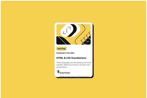
What challenges did you encounter, and how did you overcome them?i wasn't able to make the avatar image inline with the text "Name". I'm open to any suggestions. Thank you
What specific areas of your project would you like help with?The avatar and the txt "Name" are not inline.I'm having difficulty making it inline.
Community feedback
- @BrianHammerPosted 6 months ago
Hi Joshua,
Your code is a good start. One way you can center both the image and the text is to wrap the two elements in a flex box div, and set this div to make the items in the center.
It appears you have the correct font for the title, but not for the paragraphs or the buttons. If you set the font of a parent element (the <body> or container), then all elements within it will have its font. This is an easy fix, as all you need to do is put
font-family: "Figtree", sans-serif;
that you have in the title style into.container {}
.Another thing that can help your development experience is to make a separate CSS file. This will make your CSS look more readable, and easier for you to change in the future. If you are using Visual Studio Code to edit your files, there are extensions such as Prettify that will automatically format the tabs which will make your code more readable while saving you time.
Hope this helps, and feel free to let me know if you have any questions.
Marked as helpful1@SaviourjrPosted 6 months ago@BrianHammer oh yes thanks bro .🙇
I still don’t know how to use the fonts given to us . Fr I tried I don’t know how..
0@BrianHammerPosted 6 months ago@Saviourjr Fonts can be added by going to the google fonts website and link used in the style-guide.md. Navigate to the "Get Font" button when you open the link, then go to "Embed Code" section. From there you scroll until you find a section that says <link>, and you copy the entire HTML portion where it says "Embed code in <head> of your HTML. From there you go into your index.html file and paste this code anywhere between the <head> component. Now that it is downloaded, you can type the exact name of the font (include capital letters and spaces) and use it as the `font-family' attribute. Its best to apply this to the body tag, as this sets everything inside it as that font unless specified otherwise.
Hope this helps.
Marked as helpful0 - @RaphaelCarvalhPosted 6 months ago
o texto quebrou um pouco mais está bem legal
Marked as helpful1@SaviourjrPosted 6 months ago@RaphaelCarvalh obrigado cara.. você tem uma maneira de me ajudar a corrigir isso
0 - @RaphaelCarvalhPosted 6 months ago
Você pode tentar usar o flexbox e o margin-bottom/top para alinhar os itens nessa trecho.
Marked as helpful0@SaviourjrPosted 6 months ago@RaphaelCarvalh tudo bem obrigado realmente aprecio
0
Please log in to post a comment
Log in with GitHubJoin our Discord community
Join thousands of Frontend Mentor community members taking the challenges, sharing resources, helping each other, and chatting about all things front-end!
Join our Discord