Design comparison
Community feedback
- P@Artiom-DeyevPosted about 1 year ago
- The solution includes semantic HTML.
- Accessibility seems fine to me.
- I would suggest that position the main block absolutely in the center by applying:
position: absolute; top: 50%; left: 50%; transform: translate(-50%, -50%);
is maybe not the best idea, as at narrower screen width (starting at around 440px) could be still wider. However, this is also a valid solution.
Also, no media queries in the project, however, the design changes (especially the fonts) at a mobile breakpoint.
-
The code is well structured, I appreciate the use of variables in css. In main html file maybe gaps between the blocks and comments would help the readability of the code, but overall it's good.
-
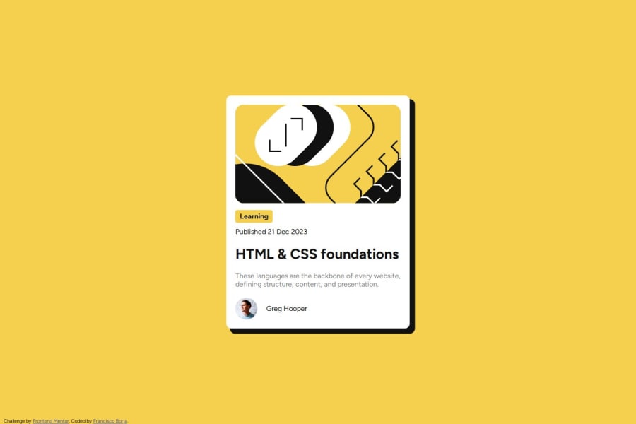
I noticed that the block is slightly wider then in the design - which is understandable, since a different width in the design is provided. I did this too. The icon portrait of the author is smaller in the design.
0
Please log in to post a comment
Log in with GitHubJoin our Discord community
Join thousands of Frontend Mentor community members taking the challenges, sharing resources, helping each other, and chatting about all things front-end!
Join our Discord
