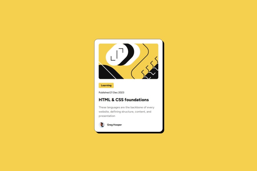
Design comparison
Solution retrospective
That I used scss variables.
What challenges did you encounter, and how did you overcome them?Nothing special.
What specific areas of your project would you like help with?I think only about font-size
Community feedback
- @gmagnenatPosted 10 months ago
Hi Rahexx, Congrats for completing the challenge ! Your solutions looks awesome and very close from the design.
I see that you liked using SCSS variables. By checking your code, I liked the way you semantically structured the HTML.
For the SCSS you could use even more variables, there are various part in your code where you are using the same value for example that's a good indicator for using variables.
About font size between screen sizes, you can check this tool for example Responsive font calculator it will help you prepare value with clamp. That's one way, you'll be able to avoid media queries. You can use this same techniques for any sizing, padding, spacing etc.
Marked as helpful1P@RahexxPosted 5 months ago@gmagnenat Thanks a lot for your feedback and thanks for the calculator I did not know about this earlier :D
0
Please log in to post a comment
Log in with GitHubJoin our Discord community
Join thousands of Frontend Mentor community members taking the challenges, sharing resources, helping each other, and chatting about all things front-end!
Join our Discord
