Design comparison
SolutionDesign
Solution retrospective
What are you most proud of, and what would you do differently next time?
Nothing exactly
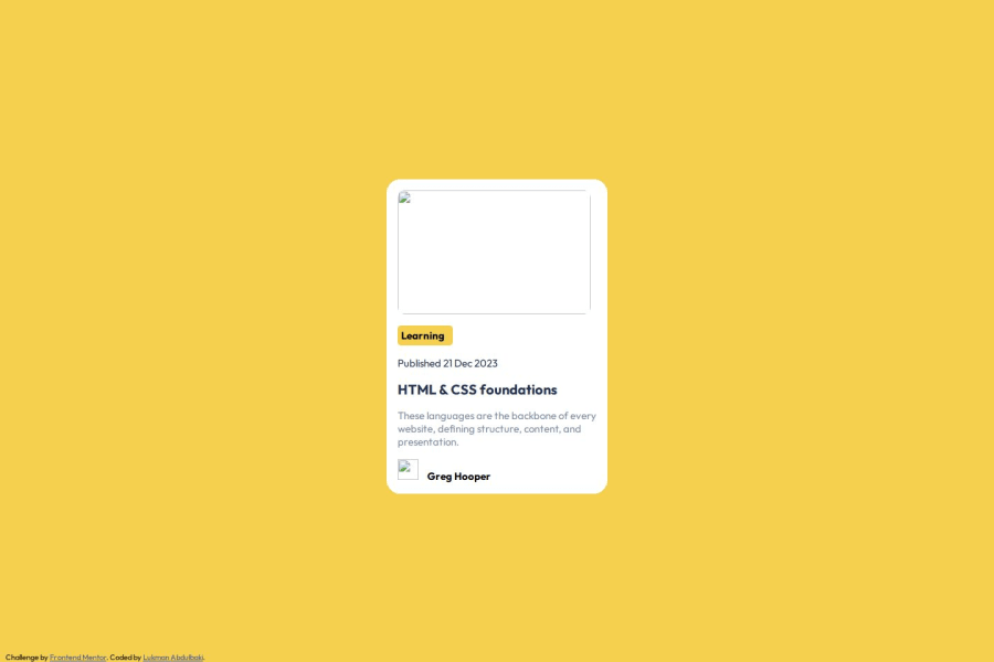
What challenges did you encounter, and how did you overcome them?I had some issues with some css like making the .card_image fill the .card to center, but I was able to complete it with some help and alot of try and error
What specific areas of your project would you like help with?Nothing exactly. just want be master my skill
Please log in to post a comment
Log in with GitHubCommunity feedback
No feedback yet. Be the first to give feedback on Abdulbaki Lukman's solution.
Join our Discord community
Join thousands of Frontend Mentor community members taking the challenges, sharing resources, helping each other, and chatting about all things front-end!
Join our Discord
