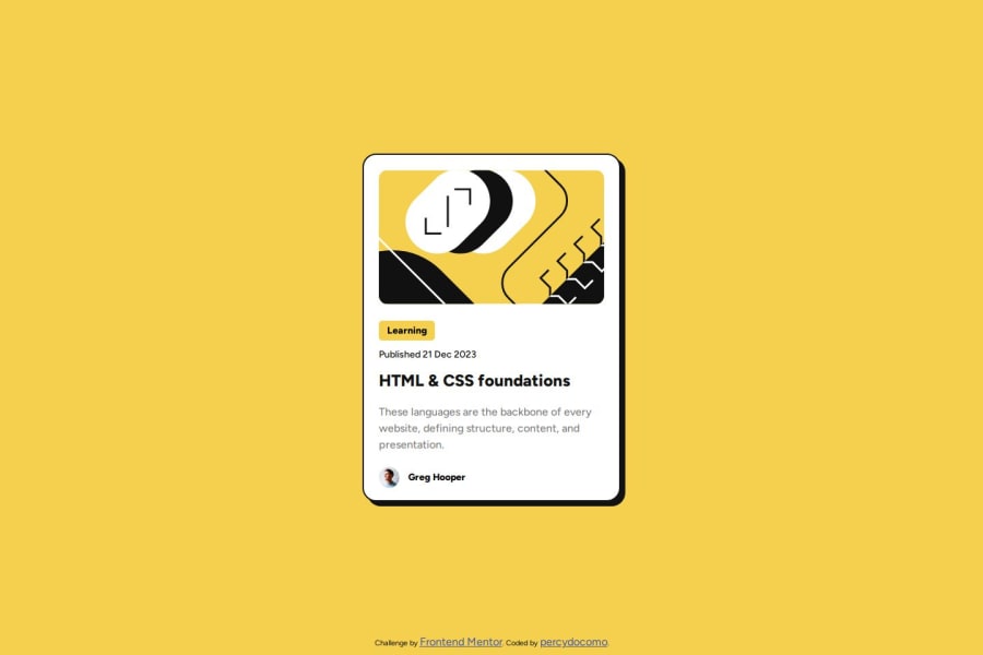


Design comparison

Solution retrospective
Setting the layout as similar as the original design. Setting the card at the center of the screen and also aligning the image and content within the card according to the original design.
What challenges did you encounter, and how did you overcome them?The card in active state has 2 effects. One effect is on a parent element and the other is on a child element. I had to figure out how to apply different effects on a parent element and a child element when the child element is on hover. CSS's pointer-events property solved the problem.
What specific areas of your project would you like help with?This solution may not be the best responsive design but I created it by looking at the mobile design pic provided. This solution does not look very good at very small device screen.
Please log in to post a comment
Log in with GitHubCommunity feedback
- @mbtenkorang
Congratulations 🥳👏🎊🎉
I observed 🥸 your media query is for mobile displays. The more ideal approach is to use it for larger/desktop displays. Also, most (if not all) sizing values are in
px. That is not very ideal for responsive design, kindly considerem,rem,percentageand other similar values. You can read more about it in this Mozilla Developer - Responsive Design article.Also, here are other few ways to improve your solution;
- Remove
.card
{position: absolute;
top: 100px;
}
It is taking the
.cardelement out of the flow of the document.- Change
.container { background-color: var(--yellow); height: 100vh; //change min-height:100vh }- You should consider putting
div.attributionoutside thesection.containerelement then change it intofooter.attributionto pass the html validation test, and if you want it to stick to the bottom then consider using a 2-row grid to create a sticky footer. Example code:
.layout{ display:grid; grid-template-row: 1fr 1rem; place-items: center center; } .card{ grid-row: 1/2; } .footer{ grid-row: 2/3; }- Responsive design recommendation: use
widthormax-widthwith percentage value forimgorpictureelement
I hope this helps improve your solution. All the best 👍👍
Marked as helpful - @bash4Dev
great


Join our Discord community
Join thousands of Frontend Mentor community members taking the challenges, sharing resources, helping each other, and chatting about all things front-end!
Join our Discord