Solution retrospective
What are you most proud of, and what would you do differently next time?
I didn't use any help! I did everything myself :D
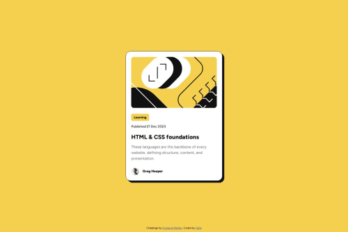
What challenges did you encounter, and how did you overcome them?The problem I had was styling the graphics/img, I think it doesn't scale perfectly to the mobile version, especially the img height.
What specific areas of your project would you like help with?I thought I still had a problem using the correct units.
Code
Loading...
Please log in to post a comment
Log in with GitHubCommunity feedback
No feedback yet. Be the first to give feedback on Fafel's solution.
Join our Discord community
Join thousands of Frontend Mentor community members taking the challenges, sharing resources, helping each other, and chatting about all things front-end!
Join our Discord