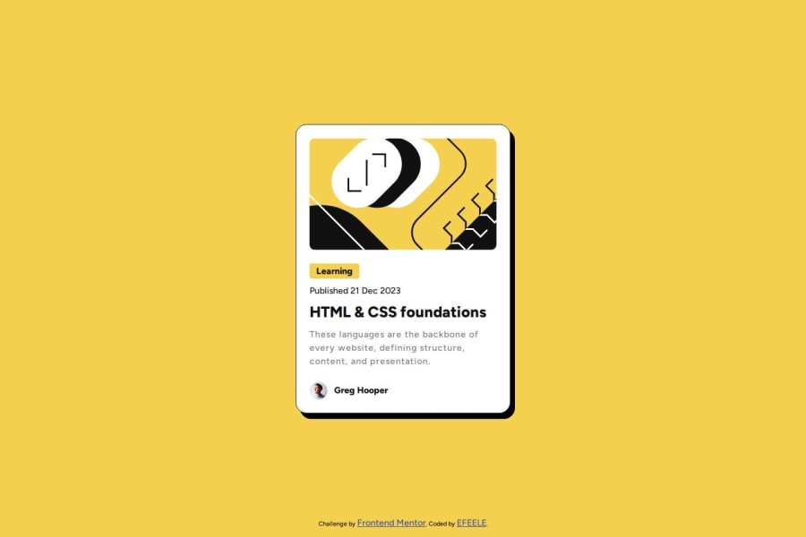
Design comparison
SolutionDesign
Solution retrospective
What are you most proud of, and what would you do differently next time?
I really liked this challenge!
What challenges did you encounter, and how did you overcome them?I had hardly used transform translate in the animations of my projects, so it was good to practice it here, it really isn't complicated.
What specific areas of your project would you like help with?I want to know everything about good practices of responsive design
Please log in to post a comment
Log in with GitHubCommunity feedback
- @marsh189
The animation looks great and it all looks as expected. One question I had, and it may be something that I am unaware of, but why did you use a div with a background image for the avatar instead of just using an img?
Join our Discord community
Join thousands of Frontend Mentor community members taking the challenges, sharing resources, helping each other, and chatting about all things front-end!
Join our Discord
