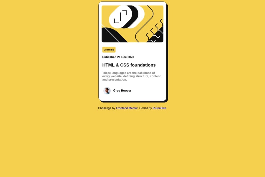
Design comparison
SolutionDesign
Solution retrospective
What are you most proud of, and what would you do differently next time?
this was the first challenge i did on frontend mentor, and I think I did just fine
What challenges did you encounter, and how did you overcome them?the positions, and layout was kinda hard but with time and practice, I'll get it
What specific areas of your project would you like help with?i'm still practicing plain CSS and HTML, the basic and best practice codes is what I'm aiming for
Community feedback
- @MaximilianoDanielGarciaPosted 11 months ago
Hi @Ruran8wa, good job!
Let me give you some suggestions to improve your development:
- Center the component. To do that, just add this:
body { display: grid; place-items: center; min-height: 100vh; }-
Set a fixed height on your
.blog-cardclass. Try withheight: 570px. -
Position the element with
attributionclass to bottom.
.attribution {
    position: absolute;
    bottom: 20px;
}
After you apply all these It will look better.
Marked as helpful1
Please log in to post a comment
Log in with GitHubJoin our Discord community
Join thousands of Frontend Mentor community members taking the challenges, sharing resources, helping each other, and chatting about all things front-end!
Join our Discord
