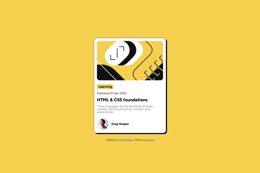
Design comparison
Solution retrospective
a lot, i had taken time off coding and just coming back to it, and i realized that i had forgotten a lot of things already
What specific areas of your project would you like help with?practicing
Community feedback
- @RegexRiddlerPosted about 1 year ago
Good job and welcome back to coding :)
Lets start with your markup:
<section class="container"> <div class="img-container"> <img class="img-fluid img" src="./assets/images/illustration-article.svg" alt="illustration-article"/> </div> <div class="texts"> <h3>Learning</h3> <p class="date">Published 21 Dec 2023</p> <h1>HTML & CSS foundations</h1> <p class="text-p"> These languages are the backbone of every website, defining structure, content, and presentation. </p> <ul> <li><img src="./assets/images/image-avatar.webp" alt="img-avatar" /></li> <li><p>Greg Hooper</p></li> </ul> </div> </section>- There is no need to wrap the article image in a container as the image is already a block element.
- The "alt" attribute is ment to offer people that uses screen readers a description of the image or to provide an alternative text when the image can't load. When a user highlights the image the screen reader reads out exactly what is written in the alt attribute. So instead of "img-avatar" a better title would be "author". Link to MDN article
Here is a snippet of how I organized my markup:
<main class="card">
  <img src="./assets/images/illustration-article.svg" alt="article illustration">
  <section>
    <span class="blog-tag">Learning</span>
    <p class="blog-date">Published 21 Dec 2023</p>
    <h1 class="blog-title">HTML & CSS foundations</h1>
    <p class="blog-description">These languages are the backbone of every website, defining structure, content, and presentation.</p>
  </section>
  <div class="author">
    <img class="author-image" src="./assets/images/image-avatar.webp" alt="author image">
    <h2 class="author-name">Greg Hooper</h2>
  </div>
</main>
I assume that you are replicating the design based on the design images which can be hard to get pixel perfect. My suggestion to you is to work on one element at the time in a top-down/outside-in manor, and only when you are happy with how it looks move on to the next element. And dont forget to adjust for different screen sizes.
I hope this helps you on your frontend journey :) And here is a link to my GitHub repo if you would like to compare.
0
Please log in to post a comment
Log in with GitHubJoin our Discord community
Join thousands of Frontend Mentor community members taking the challenges, sharing resources, helping each other, and chatting about all things front-end!
Join our Discord
