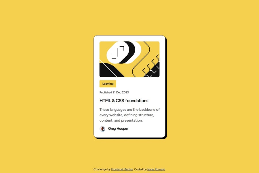


Design comparison

Community feedback
- @tailor-made-godPosted 6 months ago
Your website matches the design very well and markup is well written.
But in the mobile site the card height is too high, you can fix that by doing fixed height. And font weights are not matching the design.
But other than that your desktop site matches the design very closely.
Marked as helpful2 - @j124kloPosted 6 months ago
The project has everything needed and even more more.
It's well commented and eassy to read. It includes main, footer, h1 and even css reset. It uses variables for collors, so it is easier to make some changes to the side. The side looks good no matter of device you use and it's orientation.
There is no issues with it. 10/10, great job.
Marked as helpful1


Please log in to post a comment
Log in with GitHub
Join our Discord community
Join thousands of Frontend Mentor community members taking the challenges, sharing resources, helping each other, and chatting about all things front-end!
Join our Discord