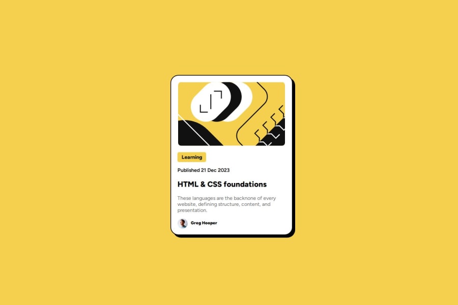


Design comparison

Solution retrospective
Knowing how to get that learning button style thing below the image and figuring out how to get the name next to the avatar.
What challenges did you encounter, and how did you overcome them?Getting everything centered and then getting the text to be left but still in line with the image. I had to remember that CSS is cascading and if I added text-align: left it would override the original text-align: center
What specific areas of your project would you like help with?This one went a lot smoother than the first challenge.
Community feedback
- @huyphan2210Posted about 2 months ago
Hey DanielJamesPM,
I reviewed your solution and have a couple of suggestions:
- There’s no need to set width: 100vw on the <body> tag. Since the <body> is a block-level element, it automatically occupies the full width of the viewport. Block-level elements start on a new line and stretch to fill the width of their container (the browser window, in this case). Elements like <div>, <p>, and <header> behave the same way. Since the <body> tag already acts as a block element, it doesn’t require a specific width.
- Instead of using height: 100vh, I’d recommend using min-height: 100vh. This ensures the body takes up at least the full height of the viewport but allows it to expand if the content requires more space.
- Regarding the card component (which you’ve styled with width: 380px and height: 500px), I noticed an issue on smaller screens, like the Galaxy Z Fold 5, where the viewport width is less than 380px. This causes the card to be cut off because the content is wider than the screen. To fix this, you could set the card's width to 100vw and use max-width: 380px (or convert this value to rem units for better scalability). Additionally, setting min-height: 500px instead of a fixed height will allow the card to maintain its minimum size but adjust for more content if needed.
Overall, great job! I hope these suggestions help you improve your solution.
0@geomydasPosted about 2 months ago@huyphan2210 Don't skip heading levels either. There's a lot of issues regarding the HTML
- Use a link for the
Learningtext, in most sites it will likely link you either to a page with a topic of learning - Don't skip heading levels! Replace the
Greg Hoopertext with a paragraph. - Nest a link inside the heading. What's the point of a blog preview card?
- Add alt to text to images, they're not mandatory but really helpful for screen readers. There might be exceptions on when to not right alt text but this isnt the case here.
- Replace the span with a paragraph. Spans are only used for styling purposes such as changing the color of a specific word inside a paragraph.
1


Please log in to post a comment
Log in with GitHub
Join our Discord community
Join thousands of Frontend Mentor community members taking the challenges, sharing resources, helping each other, and chatting about all things front-end!
Join our Discord