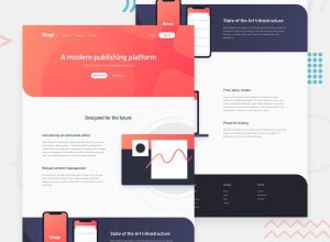
Design comparison
Solution retrospective
bootstrap v.5.2
Community feedback
- @elaineleungPosted about 2 years ago
Hi Fazza, first off, great job building this with Bootstrap! 😊
This isn't an easy challenge due to the many elements that need to be positioned, especially the ones that are positioned off the screen. If you want to make that happen, you can try using margin left/right with negative margins and with overflow hidden, or absolute positioning. I do think that for other parts in the design, such as the font color and even how the text appears (uppercase/lowercase), you can try your best to follow the design. Right now, the font color in the hero is black when the design's is white, and in the footer, you have the nav link titles in uppercase when only the first letter is capitalized. Even if you don't get the positioning of the images right, I think it would be very good if you can still at least make sure the design is consistent, and that's probably most important here!
Marked as helpful0
Please log in to post a comment
Log in with GitHubJoin our Discord community
Join thousands of Frontend Mentor community members taking the challenges, sharing resources, helping each other, and chatting about all things front-end!
Join our Discord
