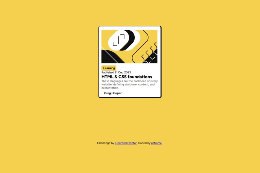


Design comparison

Solution retrospective
I really liked that I was able to grasp the concept of grid and flex better in order to align the card right in the center without any issues, I was also able to align the content inside the card correctly without any issues. However, I really had issues trying to edit the svg and making sure the card was responsive in mobile devices. I also feel I could've done better in building the animation.
What challenges did you encounter, and how did you overcome them?My biggest challenge by far was trying to make the design responsive, but I tried solving this by using a predetermined width and also making the font sizes responsive enough.
What specific areas of your project would you like help with?I would like help in understanding a better and more efficient way of building a responsive design for this solution. Is there a way to change the width without using media queries?
Community feedback
- P@danielmrz-devPosted 8 months ago
Hey there! 🙋🏽♂️
Congrats on completing the challenge! ✅
Your project looks fantastic!
Here's a tip to make it even better:
Using
marginand/orpaddingisn't always the best way to center an element. Try this method to center an element vertically and horizontally:📌 Apply this CSS to the body (skip position or margins to make it work correctly):
body {
    min-height: 100vh;
    display: flex;
    justify-content: center;
    align-items: center;
}
Hope this helps!
Keep up the great work!
0 - P@josifermaodevPosted 8 months ago
You can make your design responsive without using media queries by using a few different approaches. Here are a few techniques that can help:
1. Flexbox and Grid Layout:
Both are great tools for creating flexible layouts that automatically adjust to the screen size.
2. Relative Units:
Using relative units like
em,rem,vw, andvhcan make your design more adaptable to different screen sizes.emandrem: Proportional to the font size of the element or root.vwandvh: Proportional to the width and height of the viewport.3. CSS Functions:
CSS functions like
calc(),min(),max(), andclamp()help you create dynamic values that adjust to the context.4. Aspect Ratio:
Maintaining the aspect ratio of elements can help you create designs that automatically adjust.
5. CSS Custom Properties (Variables)
Using CSS variables allows you to dynamically adjust your design based on global variables.
These techniques can help make your design more flexible and adaptable to different screen sizes without relying solely on media queries.
0 - P@gajbos99Posted 8 months ago
Good job! Try some padding between some of the text elements and it looks exactly the same.
0


Please log in to post a comment
Log in with GitHub
Join our Discord community
Join thousands of Frontend Mentor community members taking the challenges, sharing resources, helping each other, and chatting about all things front-end!
Join our Discord