Submitted about 1 year ago
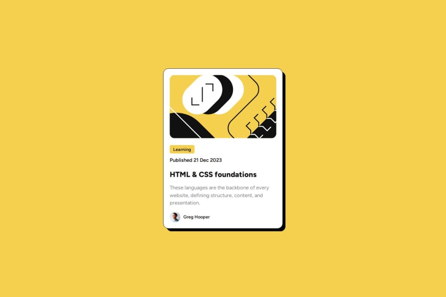
Blog-Card (Flex) 🥓
#accessibility#animation#sass/scss#jss
@3eze3
Design comparison
SolutionDesign
Solution retrospective
This project was very good to practice since I was out of shape for a while haha, in which I had problems with accessibility and some css effects. I hope you can give me some advice on my project thank you very much and happy coding. 🍟
Community feedback
Please log in to post a comment
Log in with GitHubJoin our Discord community
Join thousands of Frontend Mentor community members taking the challenges, sharing resources, helping each other, and chatting about all things front-end!
Join our Discord
