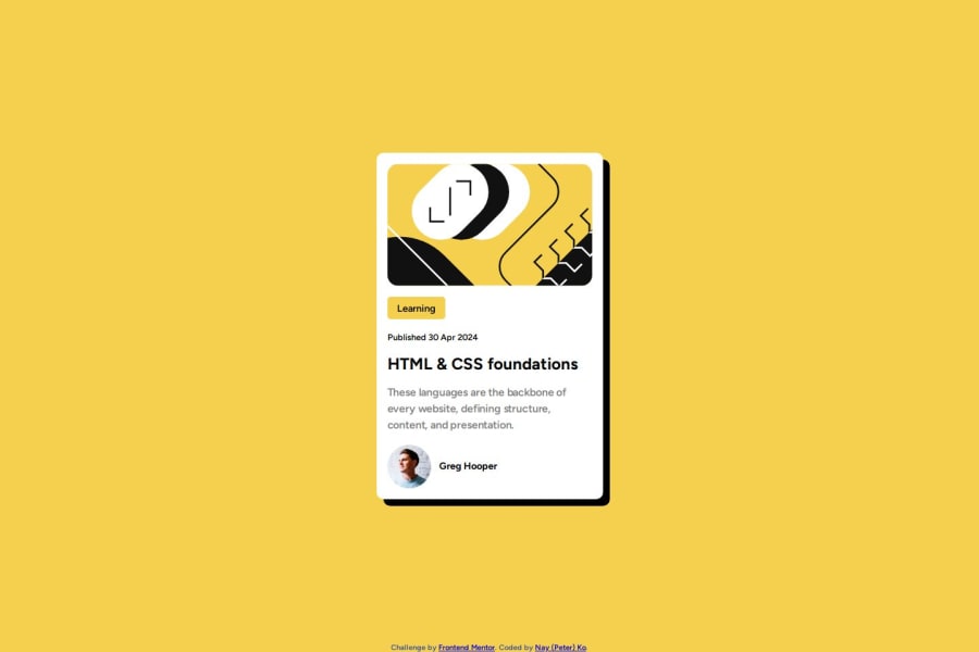
Design comparison
SolutionDesign
Solution retrospective
What are you most proud of, and what would you do differently next time?
I am most proud of deconstructing first and starting to build HTML & adding the CSS section by section and VS Code Live server shows each update and finally placing all CSS and live server final results on the same page the moment of happiness is priceless. It's give me a lot of force to do more.
What challenges did you encounter, and how did you overcome them?In the beginning, I was confuse about display and viewport, and it made me upset but go back to the theory also I tested at the code pen and finally when I fully understand I came back to the project and finish it up.
What specific areas of your project would you like help with?- Display *ViewPort *Font size, weight. *hover *border-radius and more.
Community feedback
Please log in to post a comment
Log in with GitHubJoin our Discord community
Join thousands of Frontend Mentor community members taking the challenges, sharing resources, helping each other, and chatting about all things front-end!
Join our Discord
