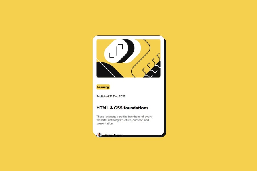


Design comparison

Solution retrospective
responsive design
What specific areas of your project would you like help with?mobile design
Community feedback
- P@loki-pepePosted 4 months ago
I can see you had a problem with sizing. I find it easier to properly size elements using
box-sizing: border-box;. You should definitively give this page a read.Also, I think you should focus more on keeping the gaps between elements resemble the ones in the design. They seem too large and your content ended up leaving the card. I don't have any specific advice, other than keep at it. Study and practice.
Regarding responsive design, your solution doesn't hold up all to well when changing screen size. I'm not an expert, but perhaps you could set two specific designs for smaller and larger screens. Note that most of the font sizes are smaller in the mobile design, which helps the layout keep the same ratio on smaller screens. Also, you could try a mobile first approach, as most users today are opening sites on their phones. This means developing the mobile design first, and then switching it up for larger screens using media queries.
Regarding your HTML, perhaps the
bodycould be your "container" and your "card" could bemain, which would improve your code readability and accessibility.Don't get discouraged by my comment. Keep at it and you should soon be making great websites!
0

Please log in to post a comment
Log in with GitHub
Join our Discord community
Join thousands of Frontend Mentor community members taking the challenges, sharing resources, helping each other, and chatting about all things front-end!
Join our Discord