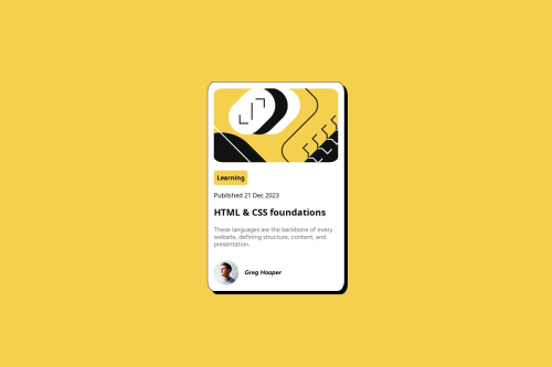
Submitted over 1 year agoA solution to the Blog preview card challenge
Blog Review Page: FlexBox Layout

@ayhem18
Solution retrospective
What are you most proud of, and what would you do differently next time?
- using the flexbox Layout extensively to make the structure close to the design
- finally understanding how flex-grow / shrink / basis behave with respect to justify-content and align-items
- My main goal was to design this page using flex layout while having a clear understanding of the behavior. I have gone through several resources prior to that and most of them seemed to just throw the attributes at me in isolation without explaining the big picture. I linked the best resource on the flex layout in the repo Readme
-
Mainly feedback on my usage of the flex layout and the responsiveness of the page
-
I am perfectly aware that several styling details are completely ignored. This was done on purpose. I am currently focusing on building a big picture of CSS and HTML focusing solely on the most important skills (the flex/grid layouts, positioning, the box model....) as I would like to move to JS and NodeJS as soon as possible.
Code
Loading...
Please log in to post a comment
Log in with GitHubCommunity feedback
No feedback yet. Be the first to give feedback on Ayhem18's solution.
Join our Discord community
Join thousands of Frontend Mentor community members taking the challenges, sharing resources, helping each other, and chatting about all things front-end!
Join our Discord