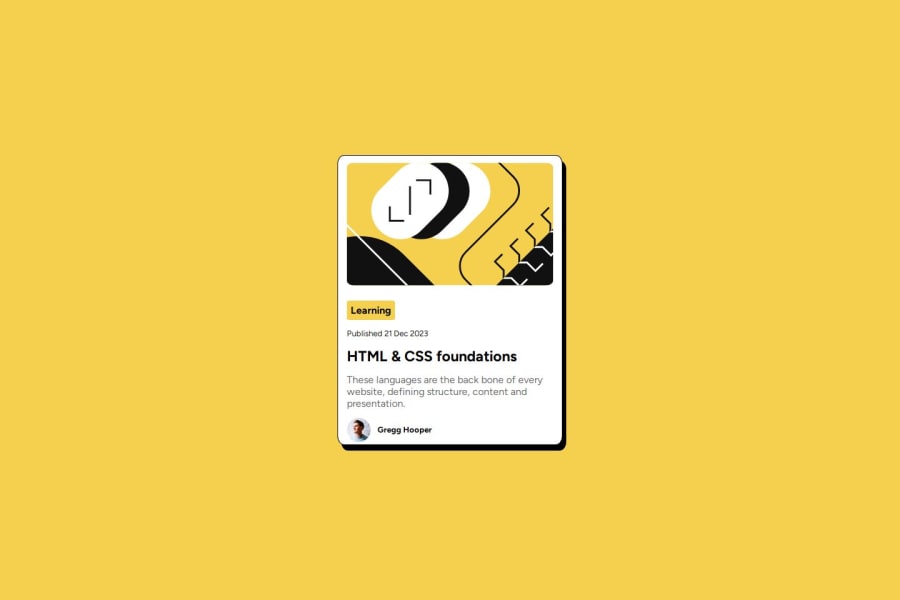
Design comparison
Solution retrospective
Unlike the first challenge i did, i opened my eyes and designed every bit of details of the page as it is.
What challenges did you encounter, and how did you overcome them?the last part, the text after an image on the same line part was a bit tricky and was overcame by my quick problem solving skills
What specific areas of your project would you like help with?NONE
Community feedback
- @dylan-dot-cPosted 5 days ago
Hey well done with this challenge! There are some code improvements you can make, because although the design is good, doesn't mean you did it the best way you could.
- Don't use percentages, especially when you are dealing with margin, padding, width and stuff like that, it's best to use rem/em or even px. With percentages you will run out of control when the screen gets too large/too small. Take a look at the mobile version using inspect or your phone. I can guess that you had to trial and error with the %s to see which exact one works best for you.
- The card isn't centered vertically. You used a margin of 7% and it will look centered to you on your device(mine as well) but might not be so on larger screens as % is always relative to the parent element.
- This is actually a free+ challenge meaning you can get the figma file for free. In that case make sure you use it, download figma and use it to help you see the exact width and height of the elements so you dont have to guess them. Also when you do, make sure you set a max-width to those elements as tho the with may be 300px it may overflow on smaller screens and not look good, so use max-width to make it fluid and limit it.
- You have used margin places where it should be padding like on the image, your card container should have a padding to space the content from the borders.
- The
inline-block
you set will cause the tag, the date and the title all be on the same line on larger screens, so please use their normal displays(span, p, h1). - For the Gregg part you could have used flexbox to help get that done easier, float is alright but sometimes it can be unstable.
Overall you have alot to work on and improve. I suggest that you complete an online HTML/CSS fundamentals course from Scrimba(for free) or from FreeCodeCamp on youtube. Then you can come back and be prepared to take on these challenges.
Put in some more hard work in and I think you can become a great programmer in the future. Don't give up!
Marked as helpful0
Please log in to post a comment
Log in with GitHubJoin our Discord community
Join thousands of Frontend Mentor community members taking the challenges, sharing resources, helping each other, and chatting about all things front-end!
Join our Discord