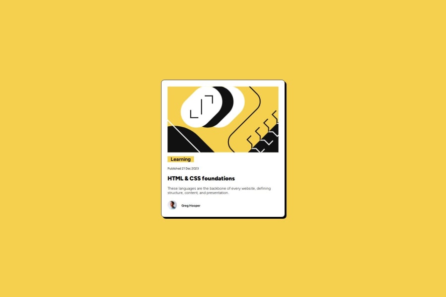
Design comparison
Solution retrospective
##learnt about align-self:flex-start to change width of a paragraph whose parent is a flexbox to not be full width
What challenges did you encounter, and how did you overcome them?specifying different width for svg adapted the parent div and it adjusted accordingly. don't know if this is right or not?
What specific areas of your project would you like help with?using figma and bringing over the designs to use.
Community feedback
- @WhitezerDPosted 7 months ago
It would be nicer if you set padding: 0, margin: 0 in css reset instead of html and body. Good job. From another newbie
1@muiruri3000Posted 7 months ago@WhitezerD thanks a lot, how could this have escaped me!?!? :D
1
Please log in to post a comment
Log in with GitHubJoin our Discord community
Join thousands of Frontend Mentor community members taking the challenges, sharing resources, helping each other, and chatting about all things front-end!
Join our Discord
