Design comparison
Solution retrospective
Understanding what I was doing this time around was a buzz and also using more semantic html.
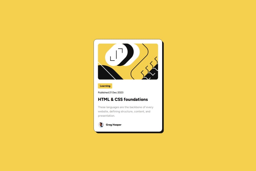
What challenges did you encounter, and how did you overcome them?Used the transform: (translate ) css property / values on my first submission for the avatar author section but used flex this time around - found it a more elegant solution. The svg resizing for the mobile bugged me and I have yet to figure it out.
What specific areas of your project would you like help with?As mentioned the svg resize for the mobile - it needs to have more height. Thinking perhaps I don't have enough wriggle room due to my flex , margin or padding settings or perhaps it was the html. Whatever it is , it's got me stumped.
Community feedback
Please log in to post a comment
Log in with GitHubJoin our Discord community
Join thousands of Frontend Mentor community members taking the challenges, sharing resources, helping each other, and chatting about all things front-end!
Join our Discord
