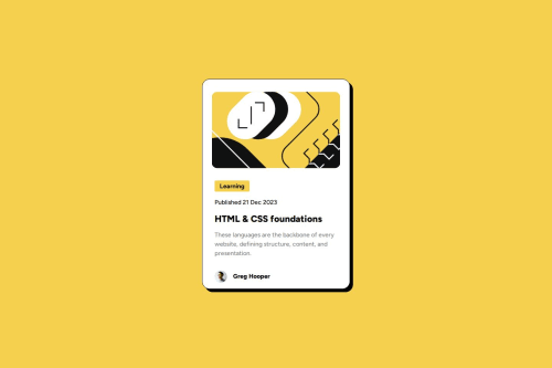
Blog Preview with only css hover effects

Solution retrospective
I learned about the difference of inline and block elements in this one because i had a problem when adding the background color yellow on the span at first it was an h4 element but upon adding the background color it took up the whole horizontal margin that is where i learned that h4 is a block element and that is when i switch it to span instead. i also learnt a bit more about css such as box-shadow and indentation.
What challenges did you encounter, and how did you overcome them?A bit of a challenge with adding the background color of the learning tag because at first it was an h4 element but when i add the background color it takes up the whole horizontal space that is when i go and checked the internet about the difference of inline and block elements that is why i just used span
What specific areas of your project would you like help with?Are there any ways to change the box-shadow of the ".content" class only when hovering on the h1 element without using js?
Please log in to post a comment
Log in with GitHubCommunity feedback
No feedback yet. Be the first to give feedback on Gabriel Romme Reyes's solution.
Join our Discord community
Join thousands of Frontend Mentor community members taking the challenges, sharing resources, helping each other, and chatting about all things front-end!
Join our Discord