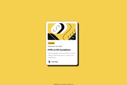
Submitted over 1 year agoA solution to the Blog preview card challenge
Blog preview with a hover state
@LLL0908

Solution retrospective
What are you most proud of, and what would you do differently next time?
I'm getting familiar with controlling the position and also believe that I can do better next time.
What challenges did you encounter, and how did you overcome them?Everything went better than last time.
What specific areas of your project would you like help with?still need to learn about how to deal with images
Code
Loading...
Please log in to post a comment
Log in with GitHubCommunity feedback
No feedback yet. Be the first to give feedback on LLL0908's solution.
Join our Discord community
Join thousands of Frontend Mentor community members taking the challenges, sharing resources, helping each other, and chatting about all things front-end!
Join our Discord