

Design comparison
SolutionDesign

Community feedback
- @mbank14Posted 3 months ago
Hello, the result is quite good, but I think there are a few things that could be improved:
The font you imported hasn't been applied yet, because the page is using the same font on every element. You can use the following CSS:
html {
 font-family: 'Figtree', serif;
}
You can also add padding to the container class so that every element doesn't need to use margin:
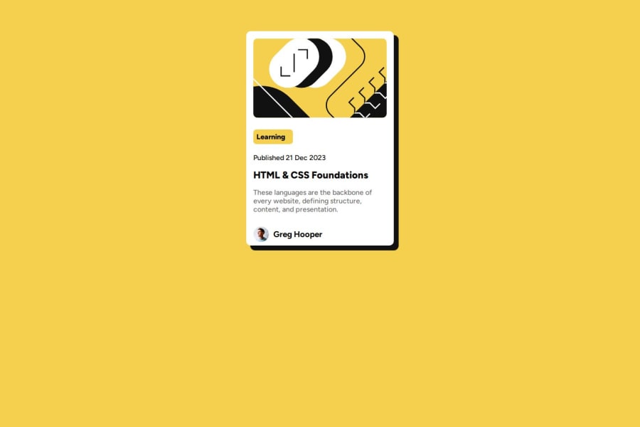
.container{
 padding: 1rem; // default browser 16px
}
For the image part, you can wrap the SVG file using the <img> tag:
<img src="yourfilesurl" style="width:100%; border-radius: 15px" />And for the profile class, you can add align-items: center to make sure the image and text are aligned properly.
Good job!
Marked as helpful1

Please log in to post a comment
Log in with GitHubJoin our Discord community
Join thousands of Frontend Mentor community members taking the challenges, sharing resources, helping each other, and chatting about all things front-end!
Join our Discord