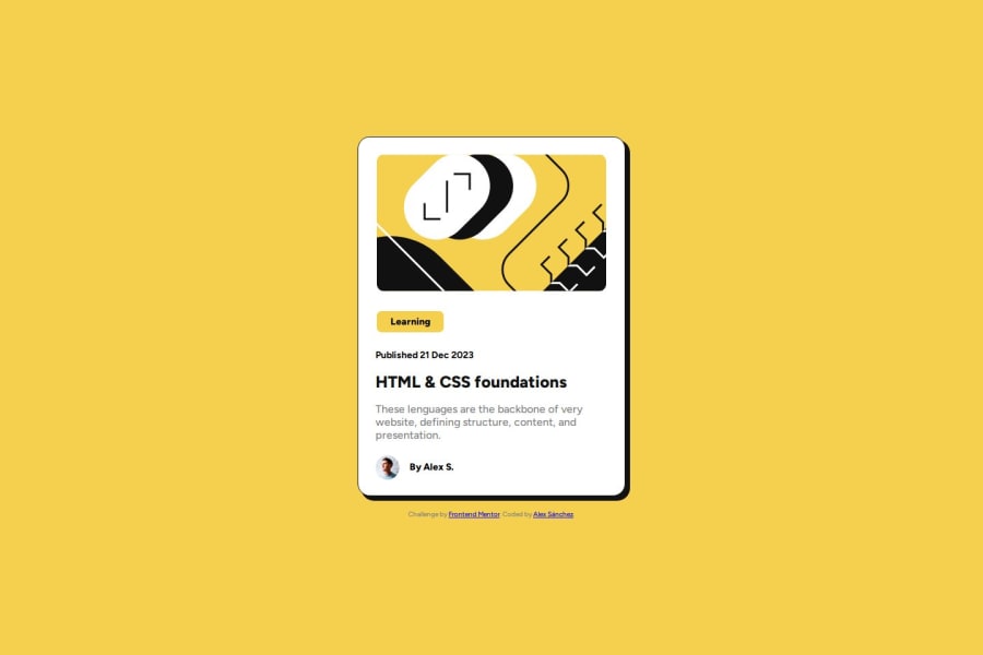
Design comparison
Solution retrospective
I am proud to be able to do it all on my own. I would like to have done it with a more stylized and organized code and for that for next time I want to use some framework
What challenges did you encounter, and how did you overcome them?The main challenge for me was that some containers were aligned to the left and others in the center, but all on the same card. To do this, I had to investigate the flex-self property that serves precisely for this.
What specific areas of your project would you like help with?I feel like my CSS code is too long and I use too many callouts. I would like to know how I could make it shorter and more stylized.
Community feedback
- @jeniveredePosted 10 months ago
Only suggestion I can make is to add line height: 1.6 to the grey paragraph text (p id=description in your code). That will give space between the lines of the text, so it is easier to read.
Otherwise, it looks really good!
Marked as helpful0
Please log in to post a comment
Log in with GitHubJoin our Discord community
Join thousands of Frontend Mentor community members taking the challenges, sharing resources, helping each other, and chatting about all things front-end!
Join our Discord
