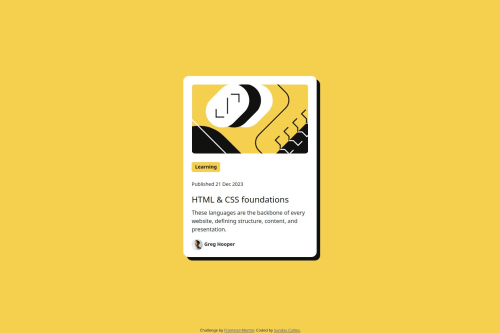
Submitted about 1 year agoA solution to the Blog preview card challenge
blog preview using css media query
bootstrap

@collins-ai
Solution retrospective
What are you most proud of, and what would you do differently next time?
I was able to make the project responsive using media query, i;m very proud about that.
Next time I'll try to write fewer line of code to save time.
What challenges did you encounter, and how did you overcome them?I had a very tough time in getting the correct spacing such as margin and padding, it cost me a lot of time and energy.
Even until now, I still don"t know how to get the exact padding and margin of elements.
What specific areas of your project would you like help with?I need help in getting the marging, padding and proper spacing of elements from the figma application.
Code
Loading...
Please log in to post a comment
Log in with GitHubCommunity feedback
No feedback yet. Be the first to give feedback on collins-ai's solution.
Join our Discord community
Join thousands of Frontend Mentor community members taking the challenges, sharing resources, helping each other, and chatting about all things front-end!
Join our Discord